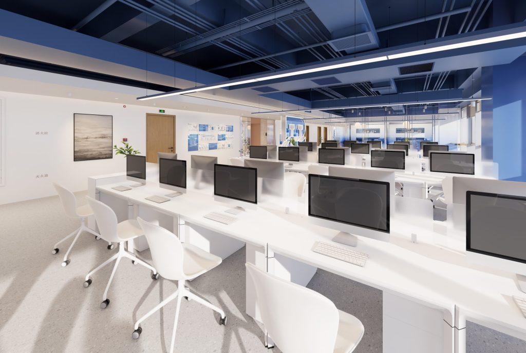
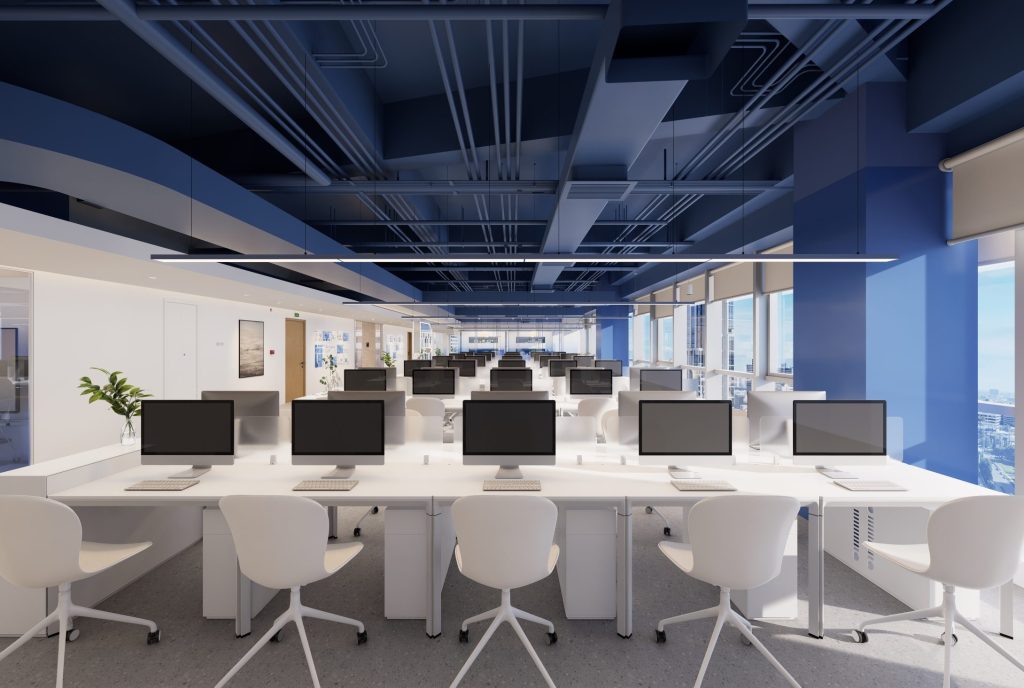
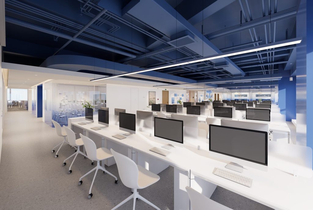
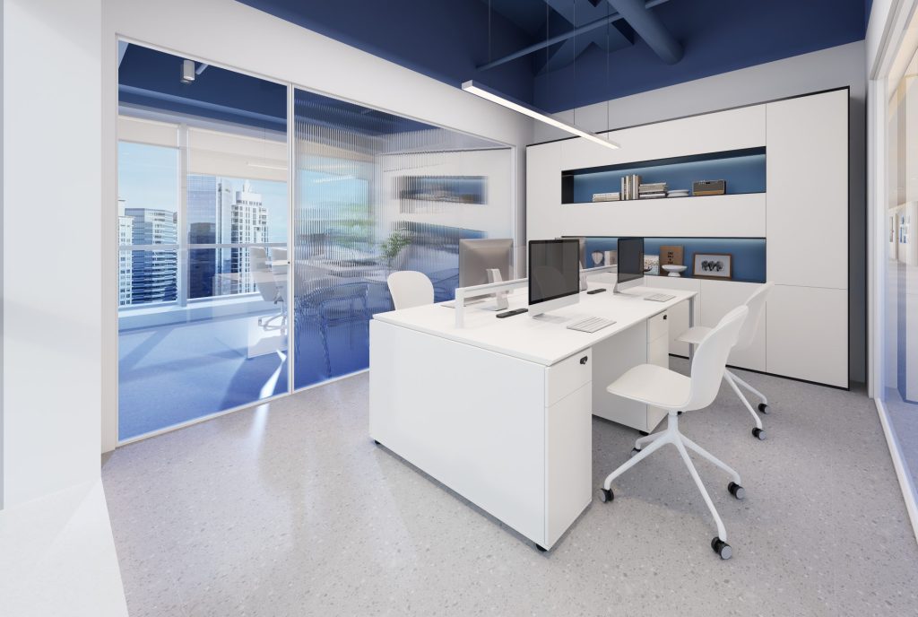
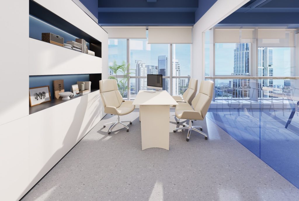
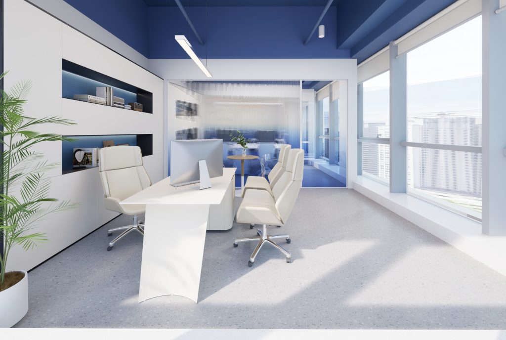
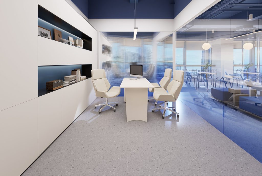
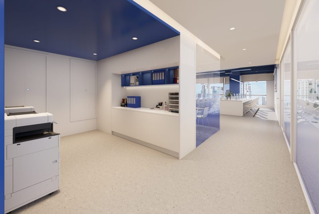
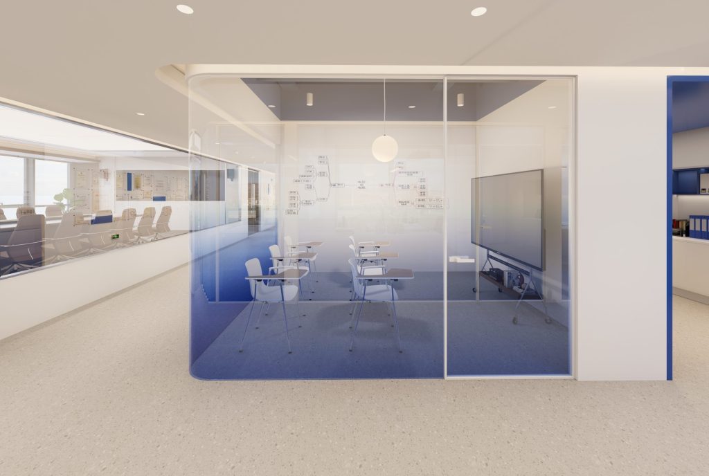
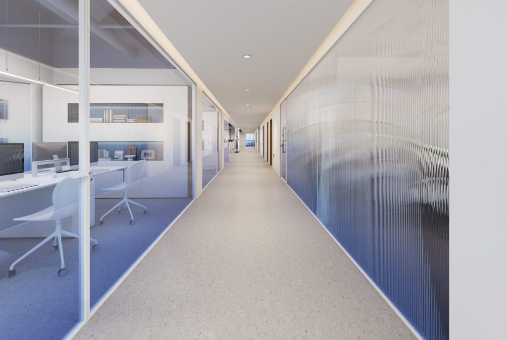
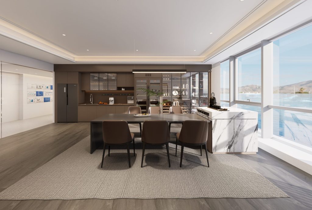
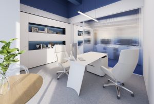
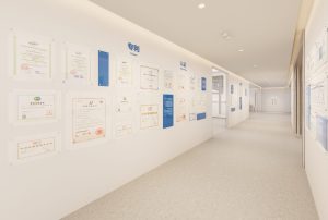
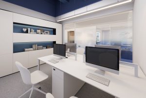
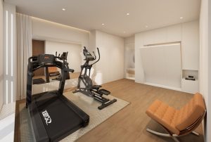
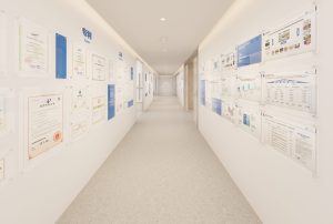
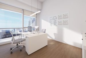
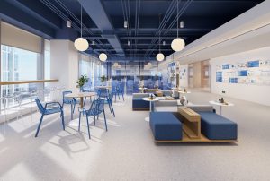
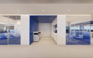
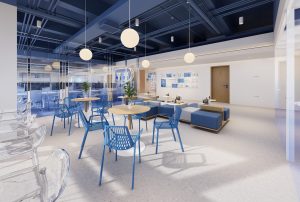
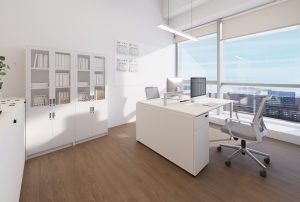
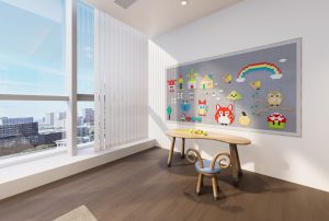
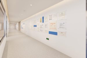
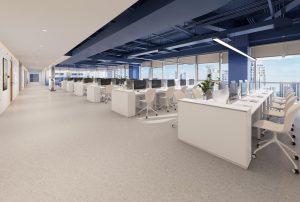
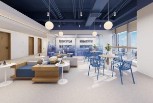
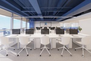
The office space design project of Guoxin Huishi Group is located in Qingdao, China. The plan revolves around the core theme of extracting space with blue technology, adhering to the design principle of “less is more”. With simple lines, pure colors, and functional layout, it creates an office space that not only strengthens the brand image but also is efficient, comfortable, and modern. It abandons complicated decorations, highlights the essence and practicality of the space, and allows employees to focus on work in a simple and bright environment to improve efficiency. Space planning: Adopting an open layout to reduce spatial barriers, making each functional area closely connected and relatively independent. Set up open office areas, independent meeting rooms, negotiation areas, leisure areas, etc. to ensure maximum space utilization and smooth personnel flow. Breaking the traditional office space pattern and building a fluid and evolving spatial system. Taking human centered experience as the core, creating flexible and precise functional layout, adapting to diverse work and interaction scenarios, and reinterpreting the new connotation of “office”.
「 Public office area 」
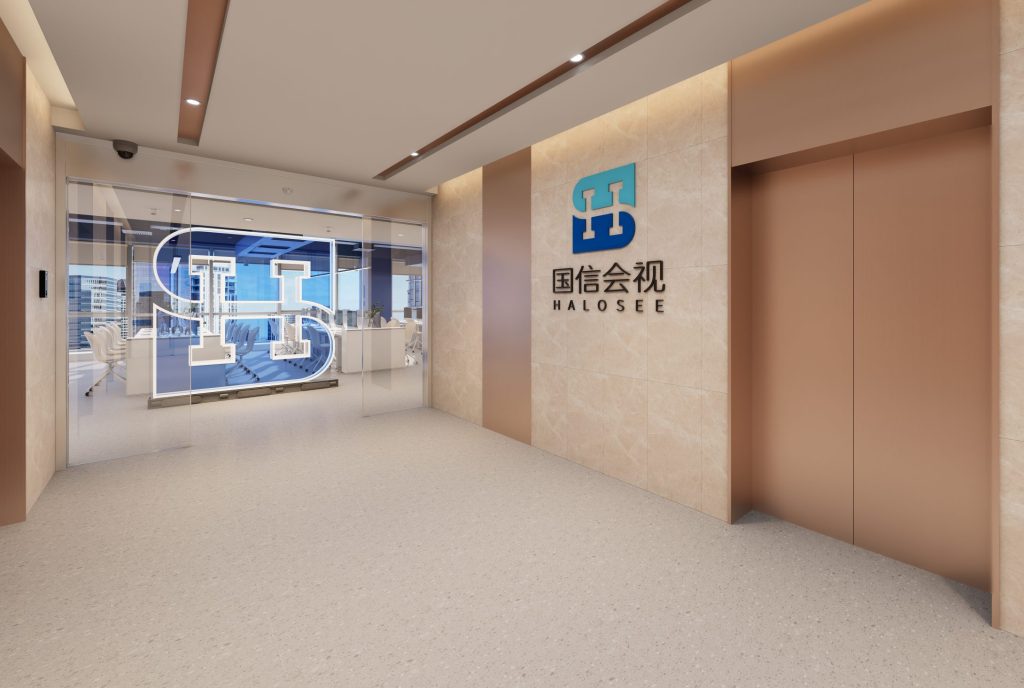
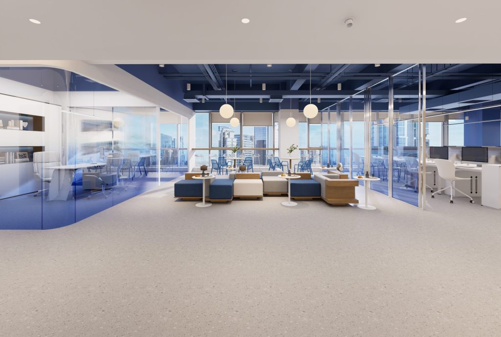
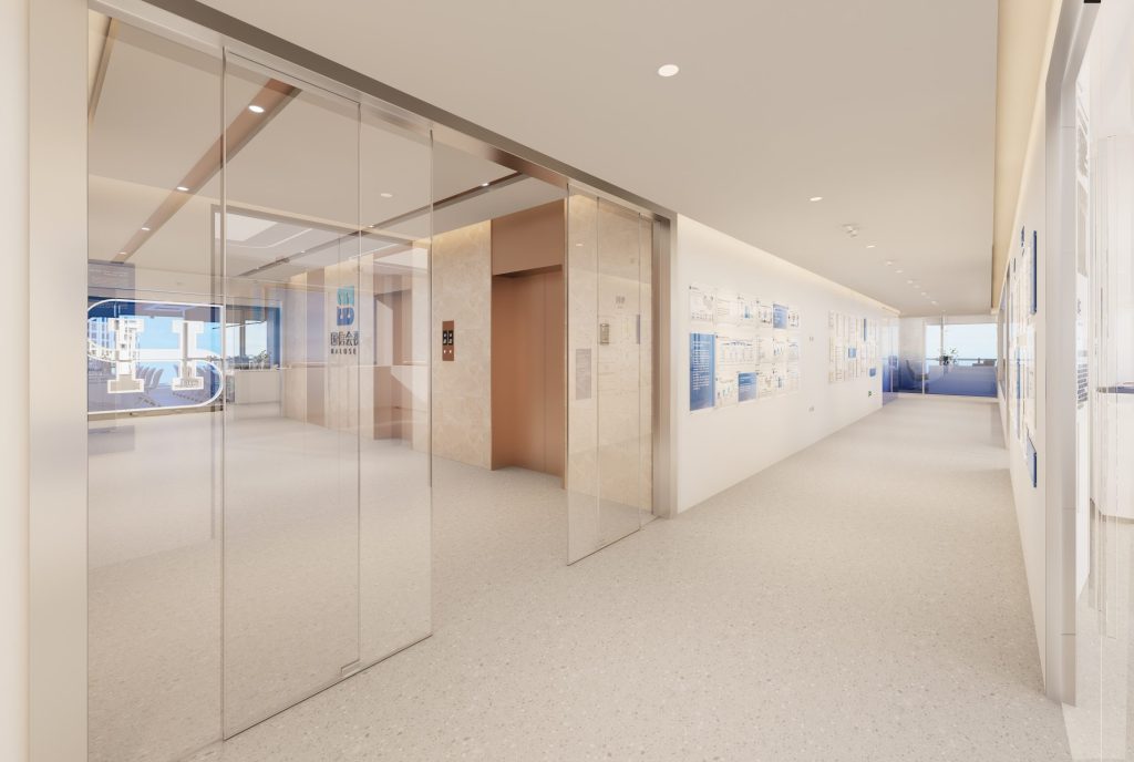
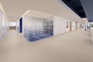
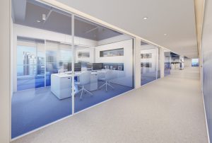
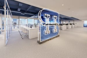
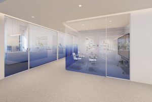
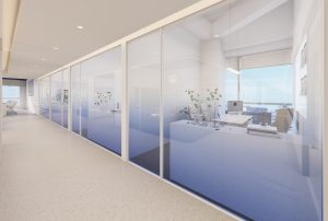
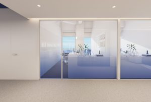
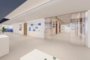
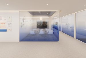
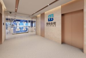
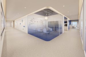
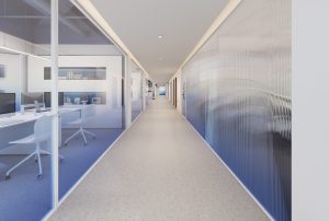
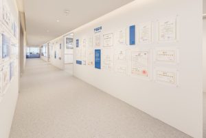
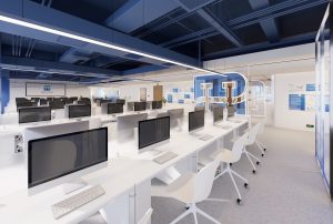
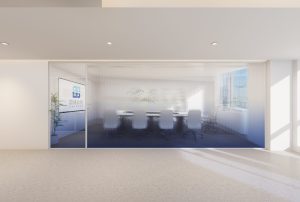
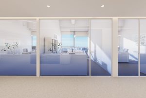
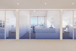
The entrance of the space is designed with a transparent partition with the “Guoxin Huishi LOGO” shape to divide the public office area and corridor space, which not only serves a certain separation function but also does not obstruct the line of sight, maintaining spatial coherence and openness.
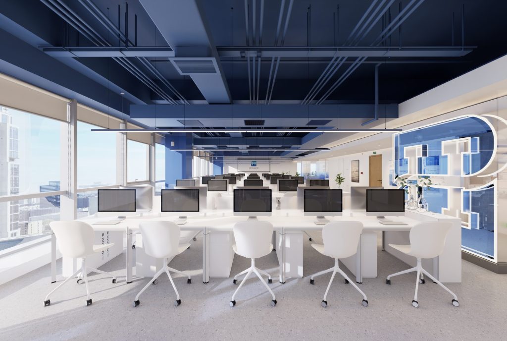
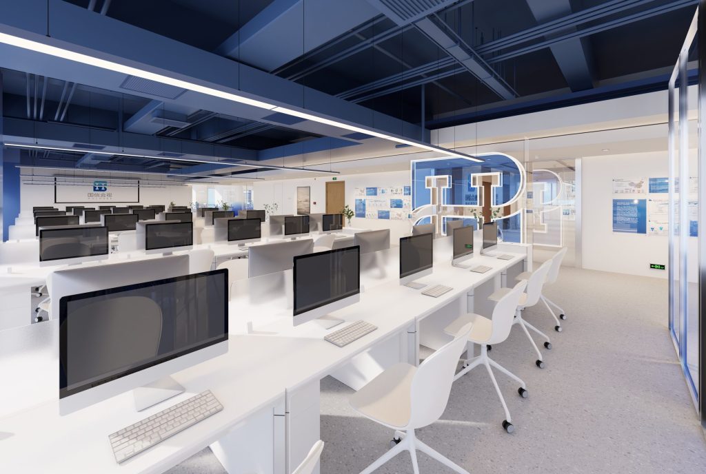
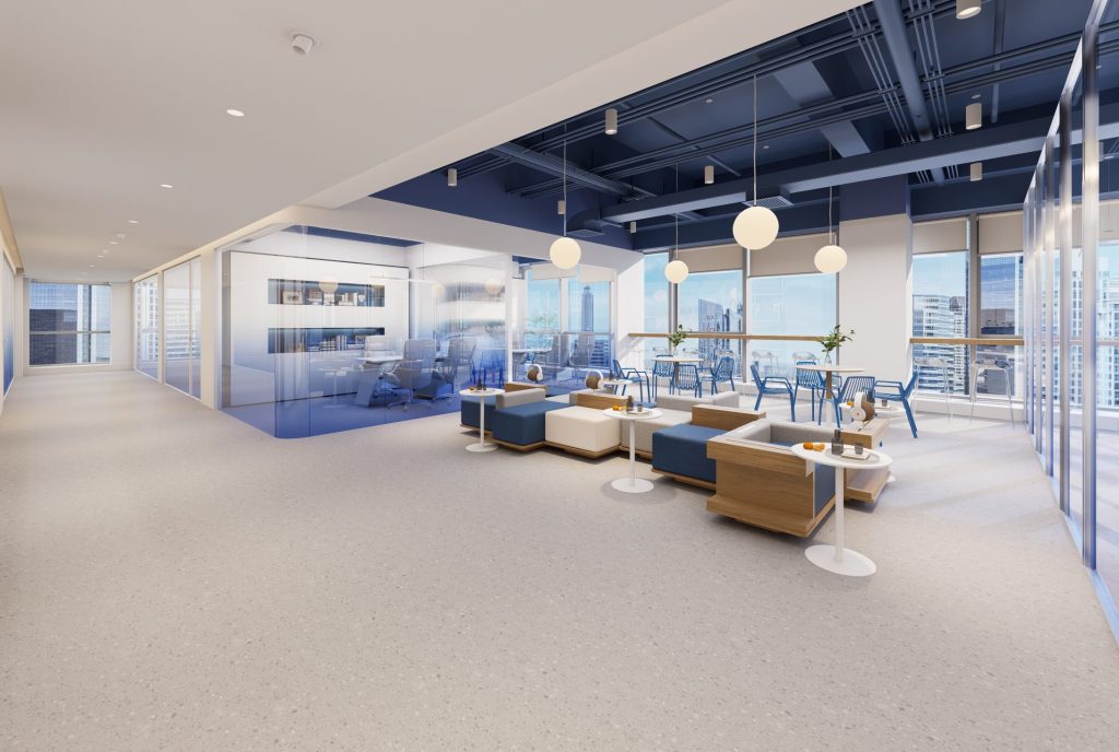
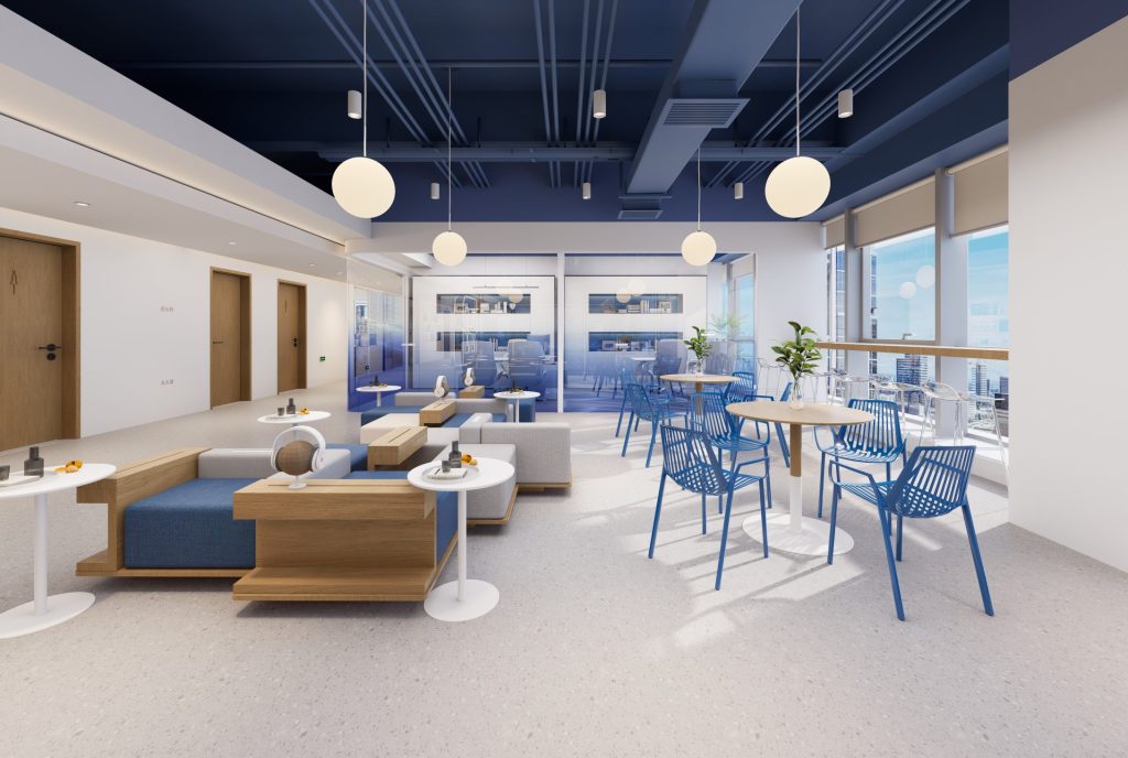
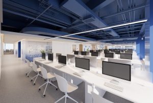
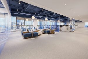
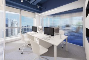
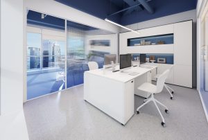
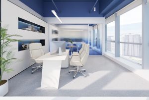
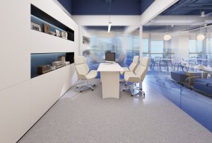
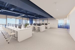
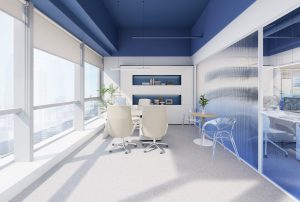
The public office area mainly uses white, blue, and wood colors in color application. White creates a bright and open atmosphere, blue adds a calm and professional atmosphere, wood brings a natural and warm atmosphere, and locally embellished with bright colored soft furnishings, enlivening the atmosphere of the space.
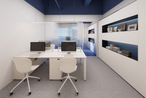
Deep blue is used in the ceiling area to increase the sense of spatial hierarchy and stability, while coordinating with white and light gray to avoid overly monotonous space.
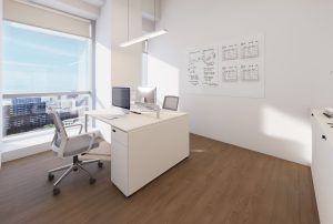
Pursuing simplicity and functionality in space, avoiding excessive decoration and intricate details. Using straight lines without excessive carving or decoration, it showcases its elegant temperament with simple and smooth lines.
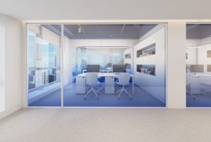
Abandon excessive partitions and adopt an open office format to create a spacious and transparent environment, promote employee communication and collaboration, and improve space utilization. Like the Google office, employees can freely exchange ideas and stimulate creativity.
「 Negotiation area 」
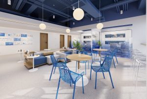
A comfortable discussion area has been set up on the left side of the public office area, equipped with blue and white sofas, wooden and white coffee tables, and high legged tables and chairs. This area provides employees with brief breaks, brainstorming sessions, or small meetings, enhancing the multifunctionality of the space.
「 Exhibition Area 」
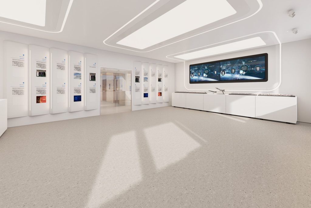
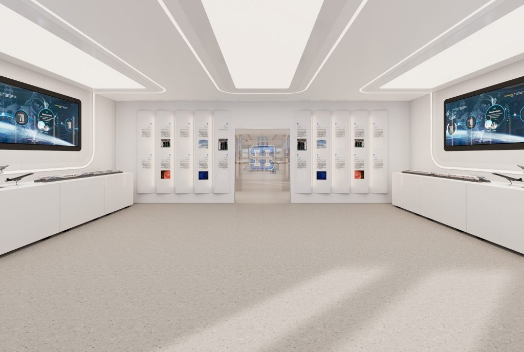
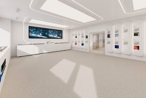
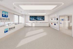
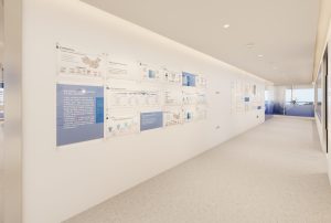
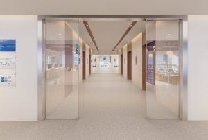
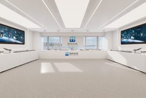
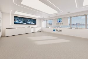
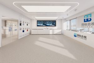
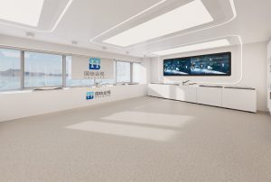
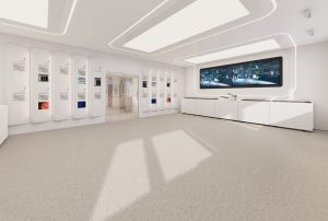
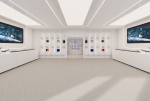
There are large display screens on both sides of the entrance of the exhibition hall, which can highlight the high-tech interface and also be used to display enterprise product functions, data information, or project achievements. The white cabinet below is used to store display equipment and related materials.
The ceiling adopts a large rectangular translucent design and is outlined with line lights, providing sufficient and uniform basic lighting while creating a sense of technology and futurism. The use of light not only enhances the brightness of the space, but also highlights the displayed content.
「 Hall Meeting Room 」
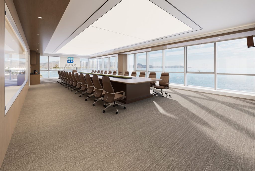
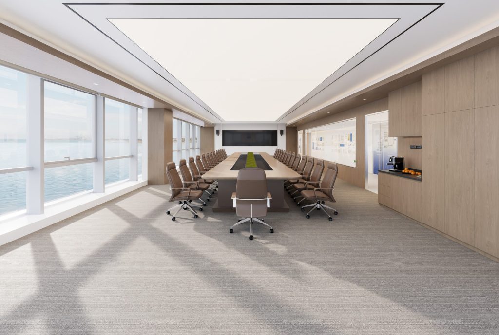
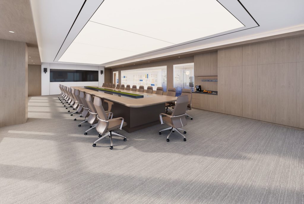
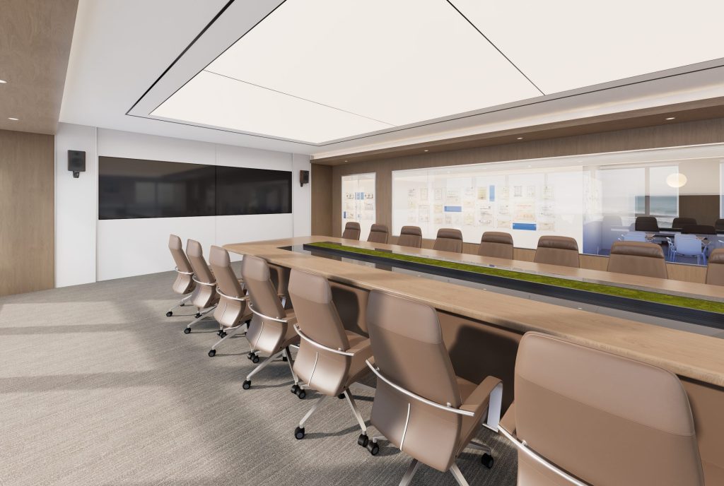
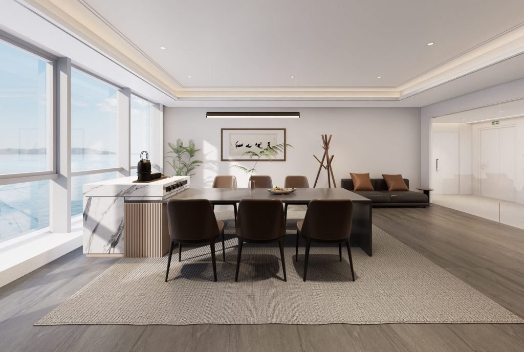
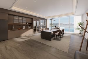
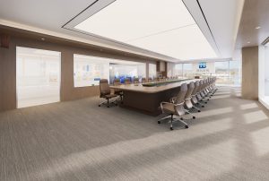
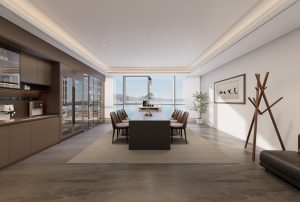
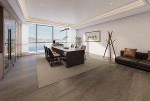
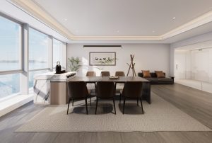
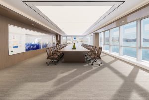
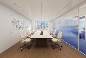
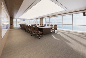
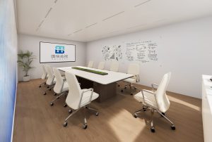
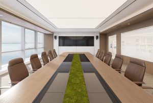
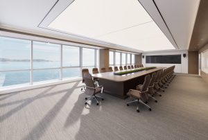
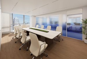
The conference room presents a modern minimalist style, with neutral tones as the main color, creating a calm, professional, and comfortable atmosphere. The spatial layout is neat and atmospheric, with simple and smooth lines, giving people a concise and efficient visual experience, suitable for formal meeting scenarios such as business negotiations and corporate decision-making.
In terms of color application, light wood, gray, and white are the main colors, paired with green plants. The color matching is harmonious and unified, creating a simple, stable, and vibrant spatial atmosphere.
In the lighting design, a large-area rectangular transparent design is adopted to provide sufficient and uniform basic lighting, making the entire space bright and transparent. Indirect lighting such as auxiliary tube lights and light strips further enrich the sense of spatial hierarchy, while avoiding discomfort caused by strong direct light, meeting the lighting needs of different conference scenes.
「 Central Conference Room Area 」
「 Vice-President Office 」
「 Combination office 」
「 North corridor 」
「 Print zone 」
「 South corridor 」
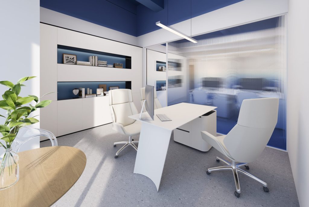
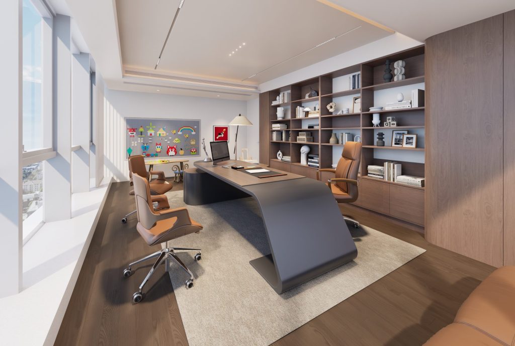
「 Chairman’s Office 」
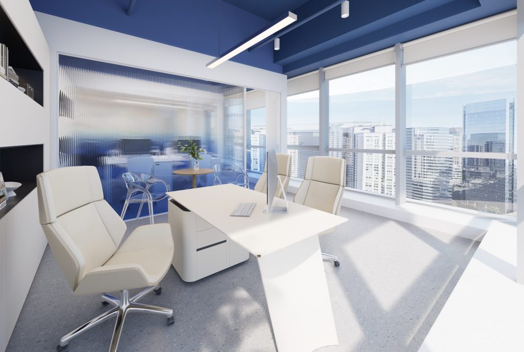
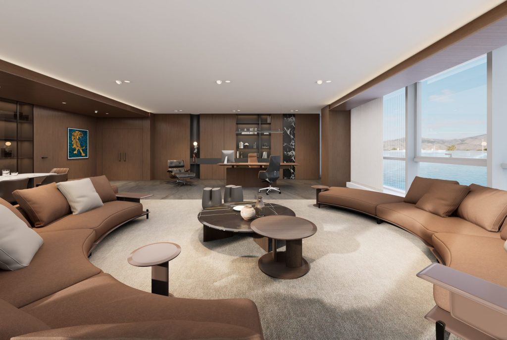
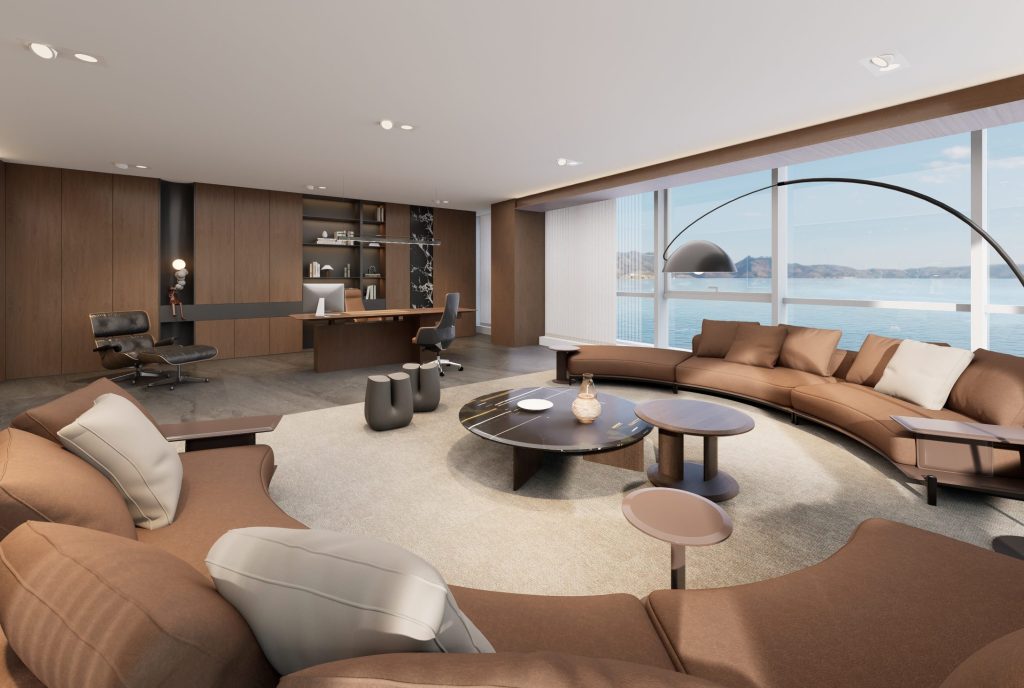
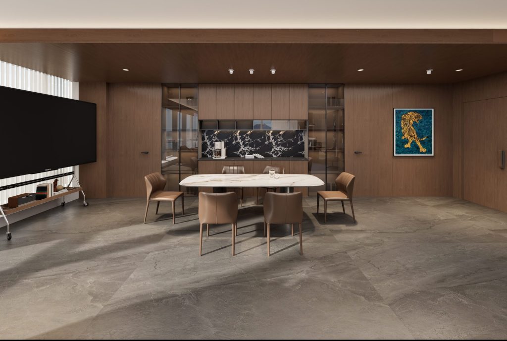
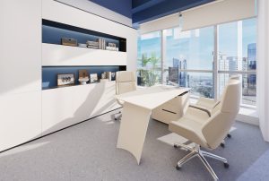
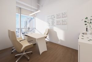
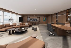
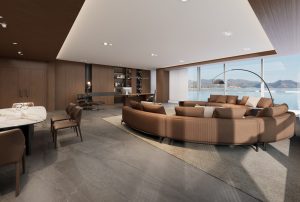
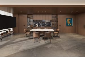
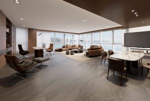
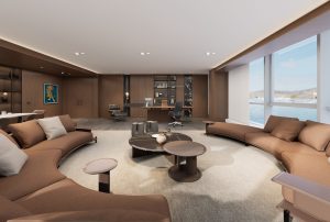
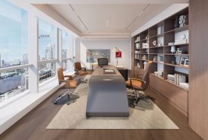
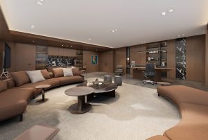
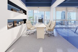
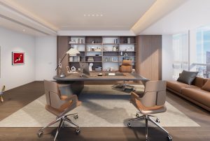
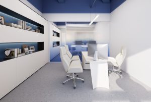
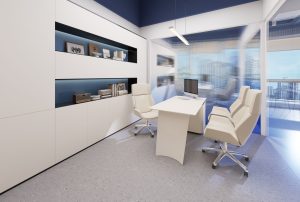
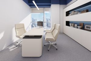
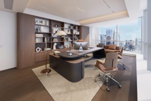
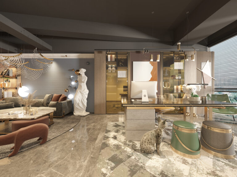
The chairman’s office uses simple and smooth modern lines, neutral tones, and geometric shapes, while incorporating high-quality materials, exquisite finishes, and fashionable design. The space structure is created with wood veneer, glass, marble, and other materials, matched with exquisite soft furnishings, creating a calm, comfortable, and elegant atmosphere.
「 Chairman’s Reception Room 」
「 Vice Chairman’s Office 」
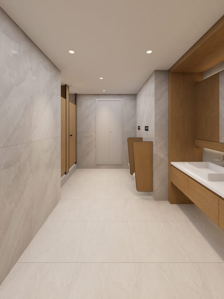
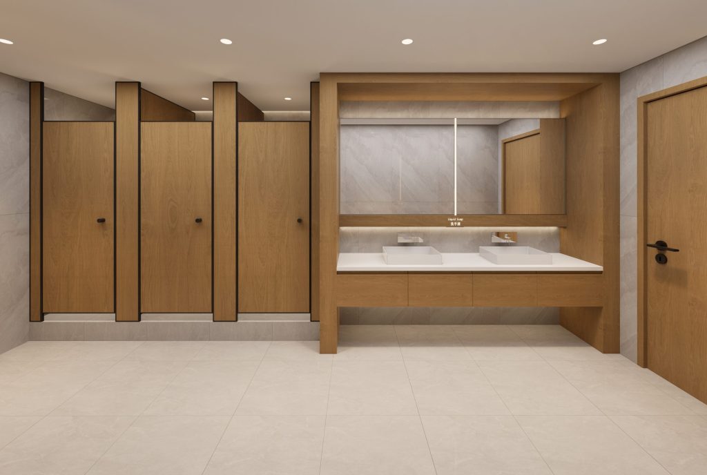
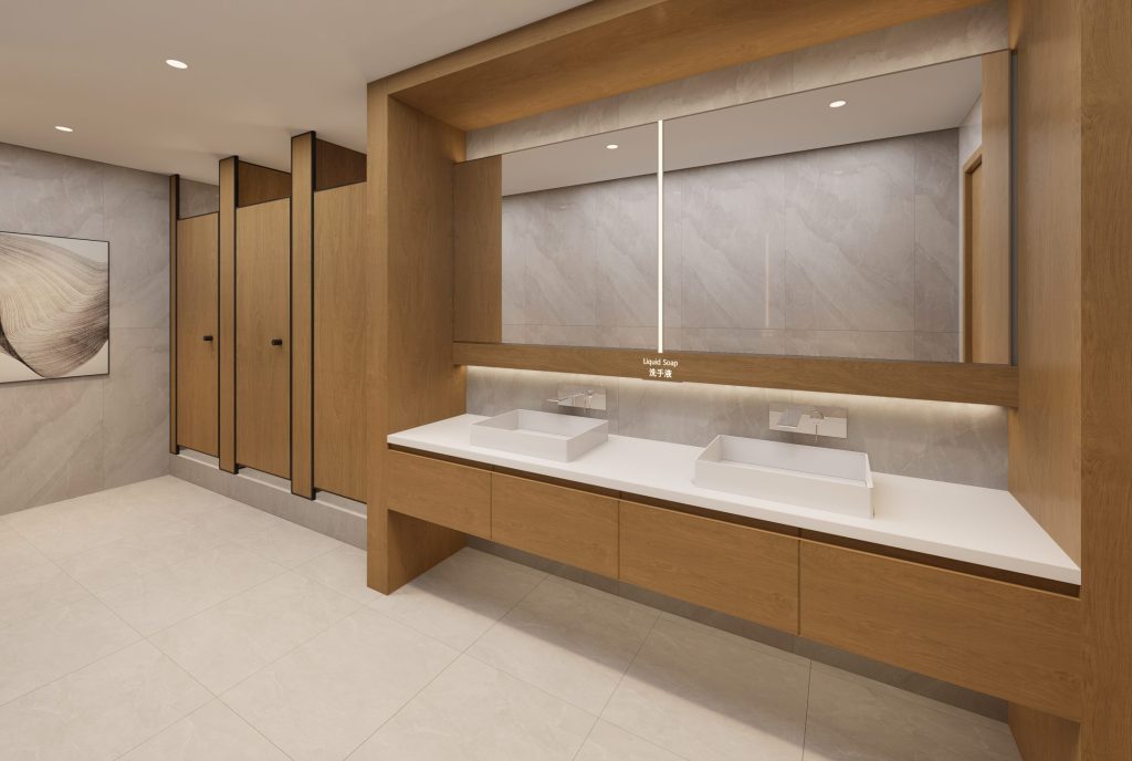
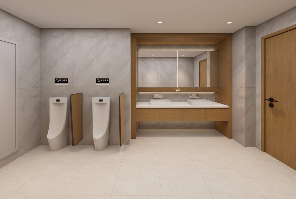
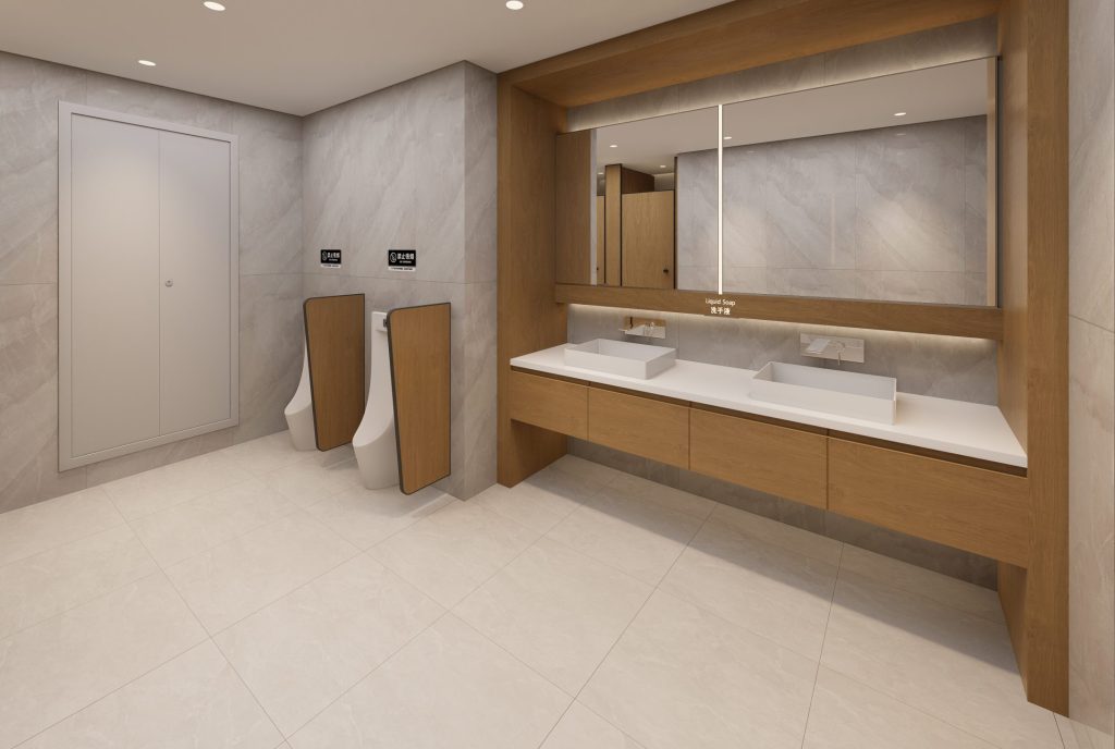
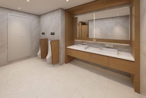
「 Public toilets 」
