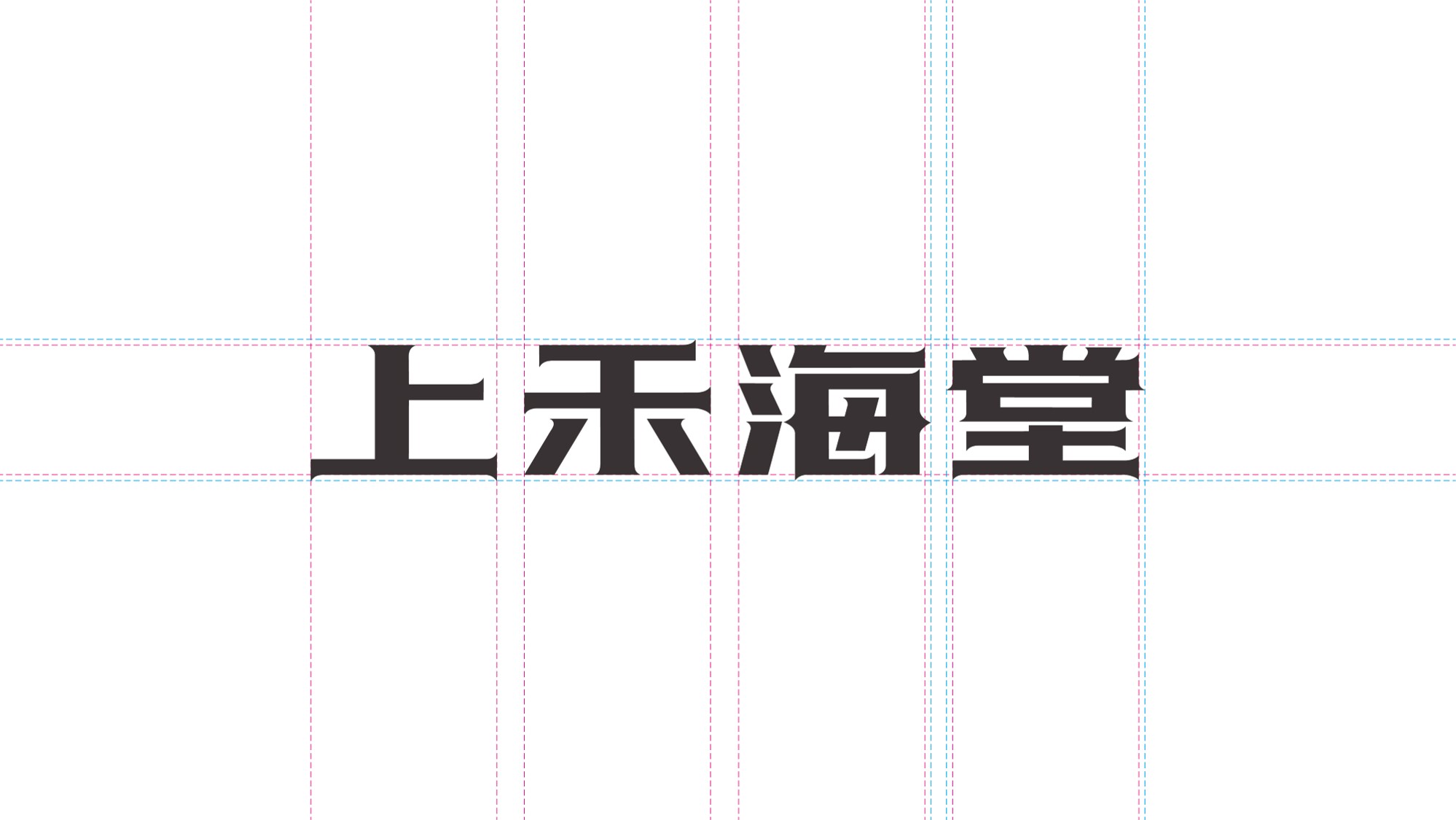
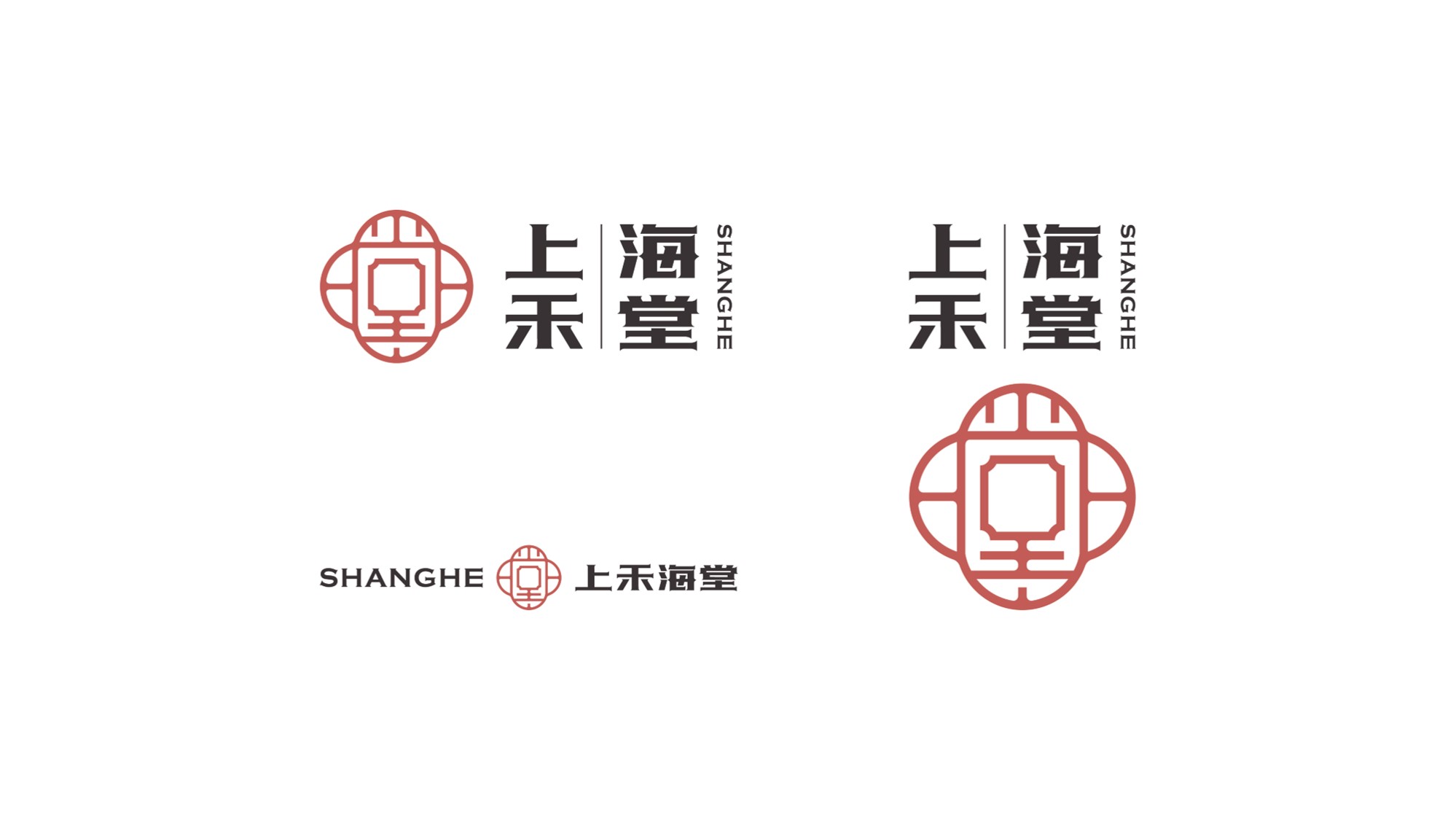
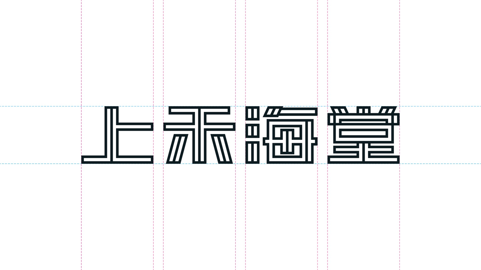
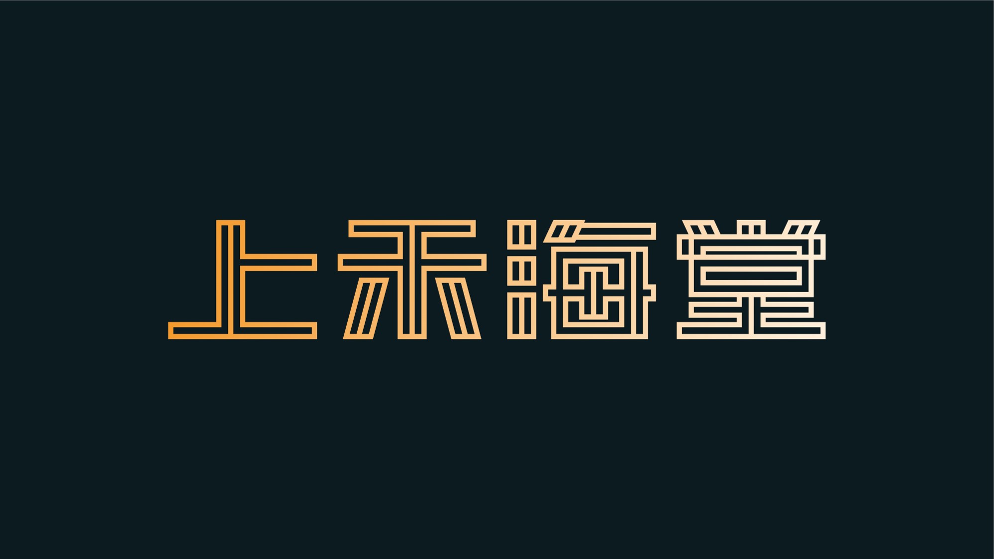
Shenzhen, China | Shang He Hai Tang | Innovative Chinese Fusion Cuisine (Restaurant)
East Meets West · Tang & Song Dynasty Elegance · Refined Simplicity
Shang He Hai Tang in Shenzhen specializes in business-oriented Chinese dining and innovative fusion cuisine, catering to corporate entertaining, social gatherings, and more. Through in-depth market research, we uncovered the brand’s cultural essence and identified a creative breakthrough—the “Begonia Flower.”
This iconic symbol, known as the “Empress of Flowers” in Chinese culture for its vibrant hues and rich heritage, became the foundation of the brand’s identity. The homophone connection between “Tang” (棠, begonia) and “Tang” (堂, hall) inspired a sophisticated palette of begonia red and muted spatial tones, blending tradition with contemporary aesthetics.
By weaving cultural nuances into modern, refined, and distinctive dining experiences, Shang He Hai Tang evokes emotional resonance among guests, strengthening brand recall and enhancing recognition in the competitive culinary landscape.
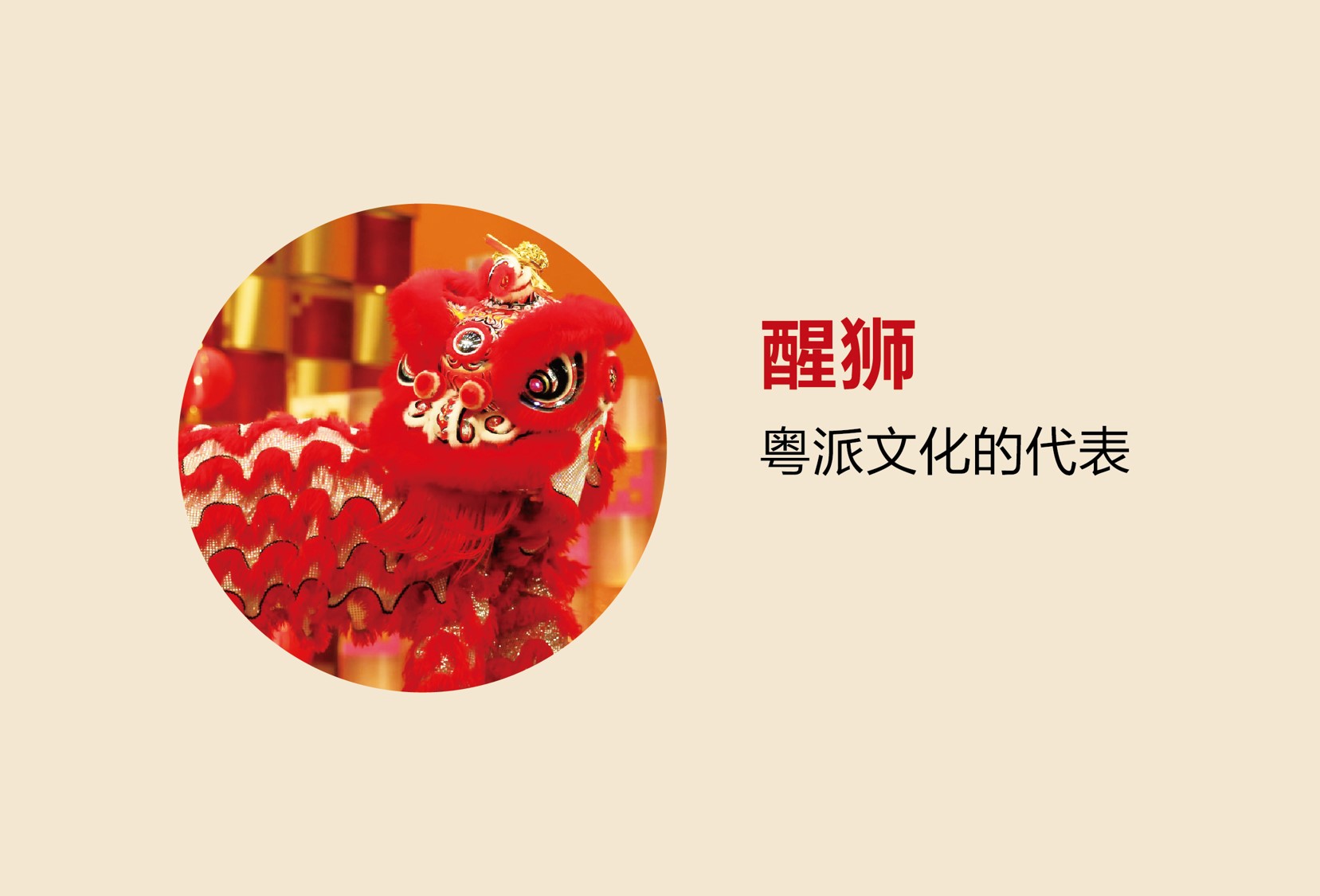
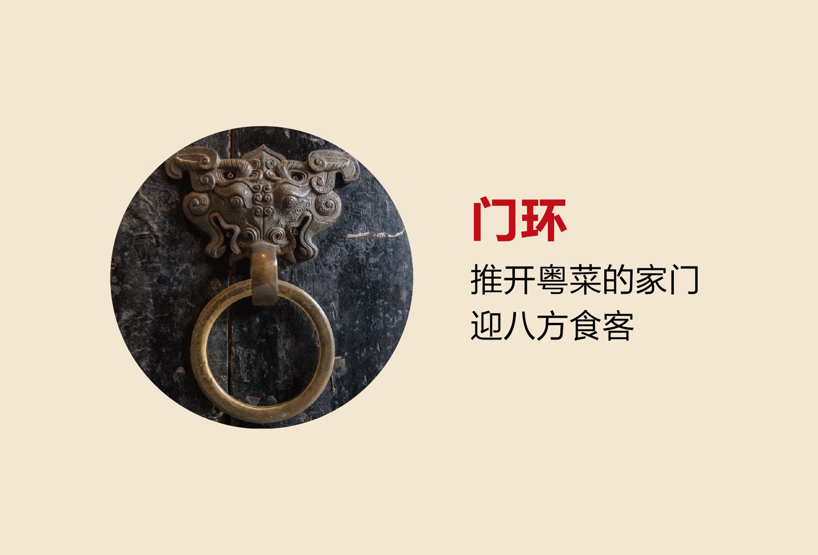
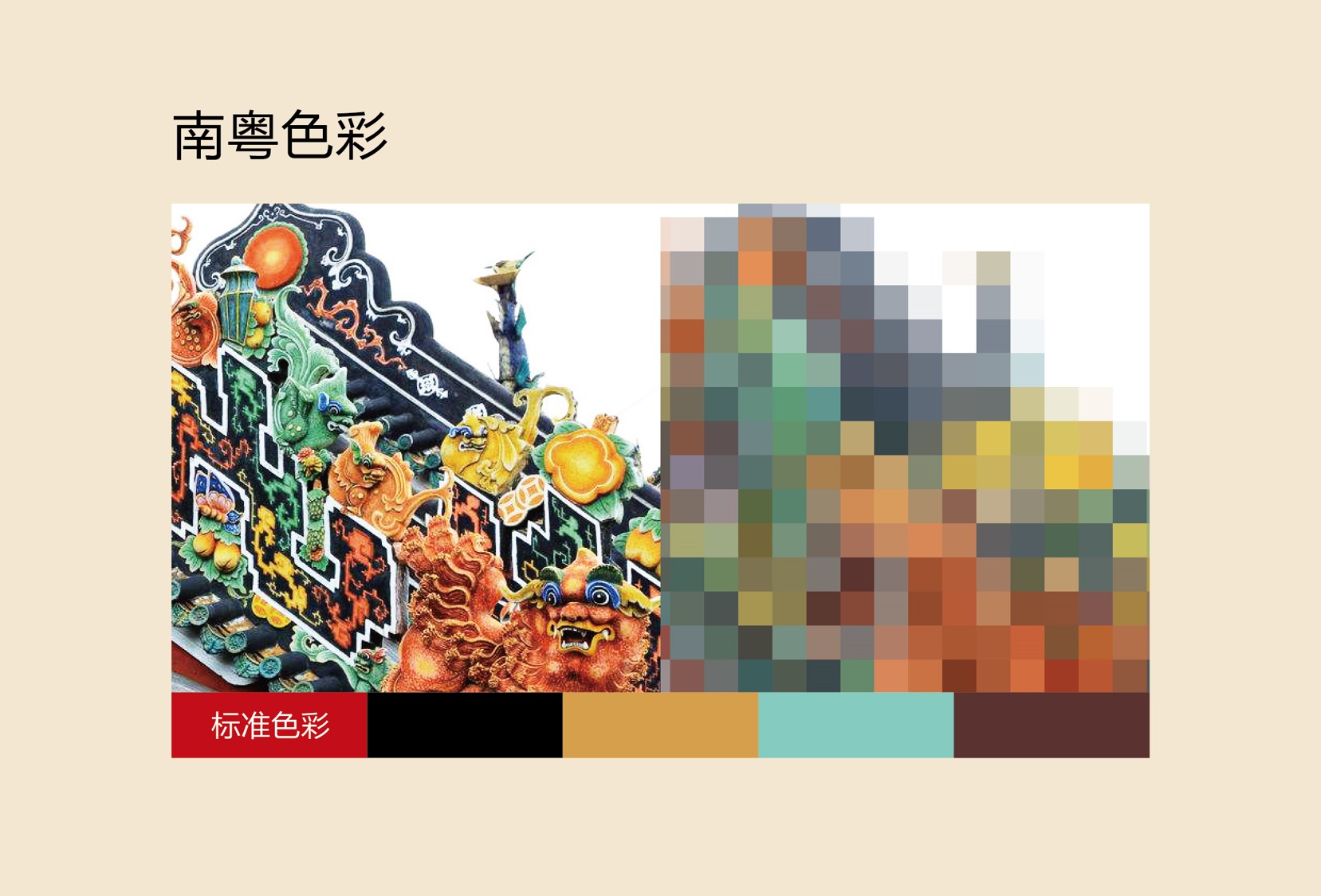
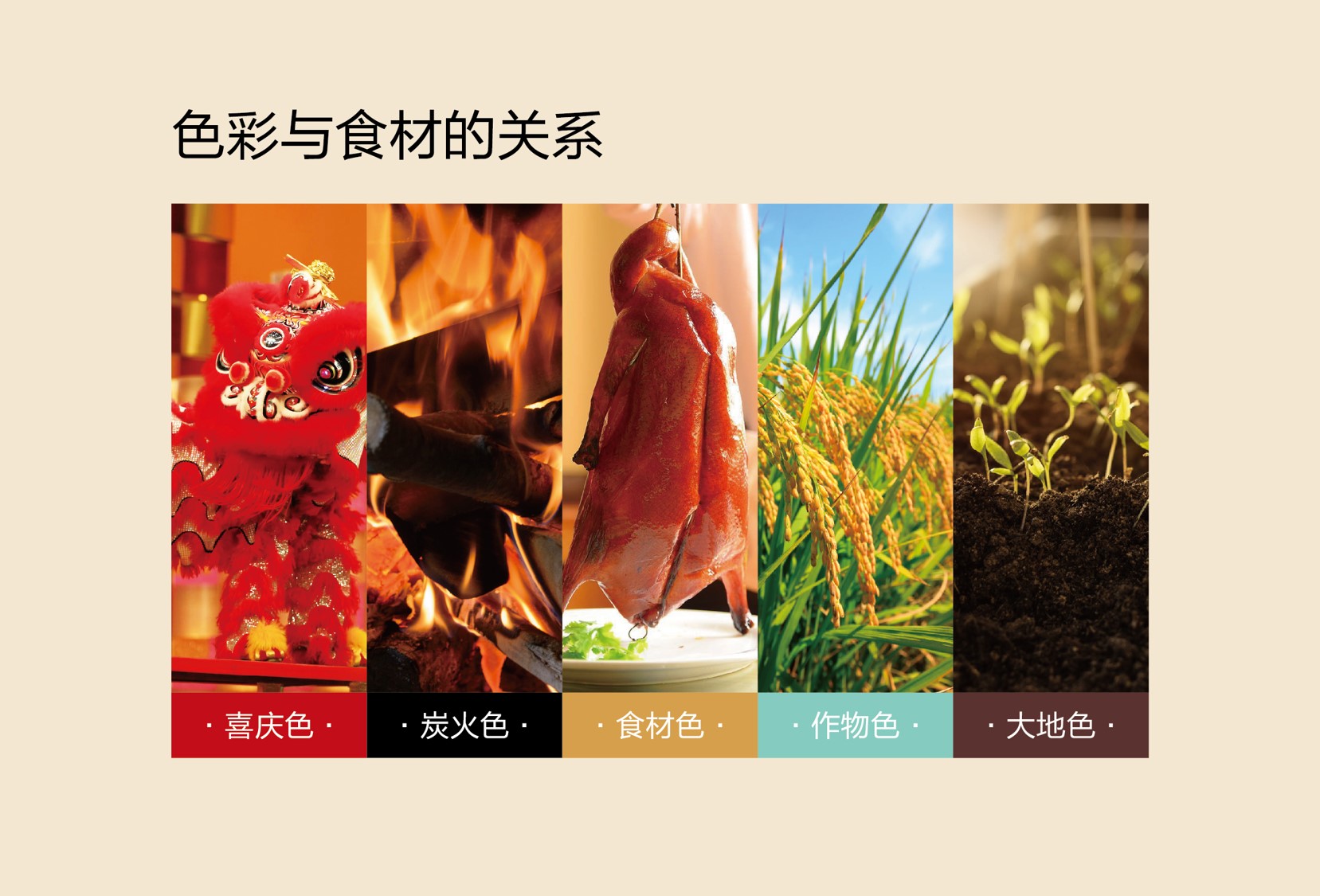
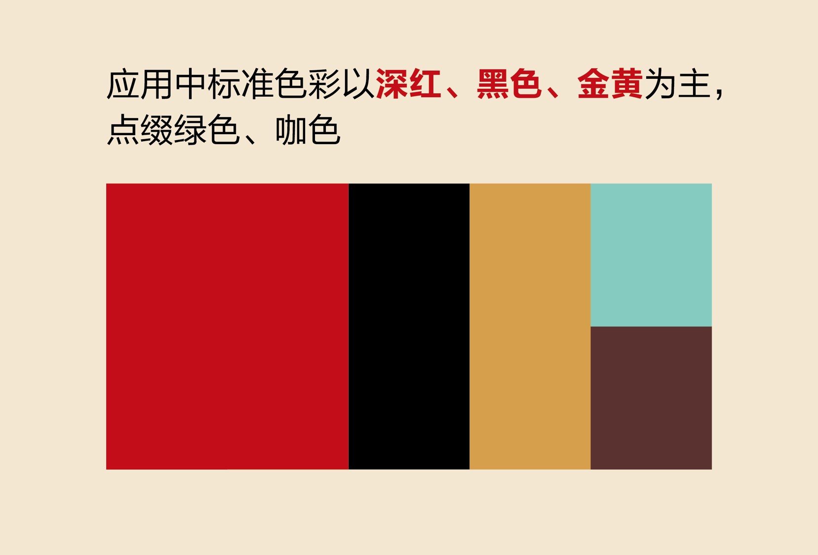
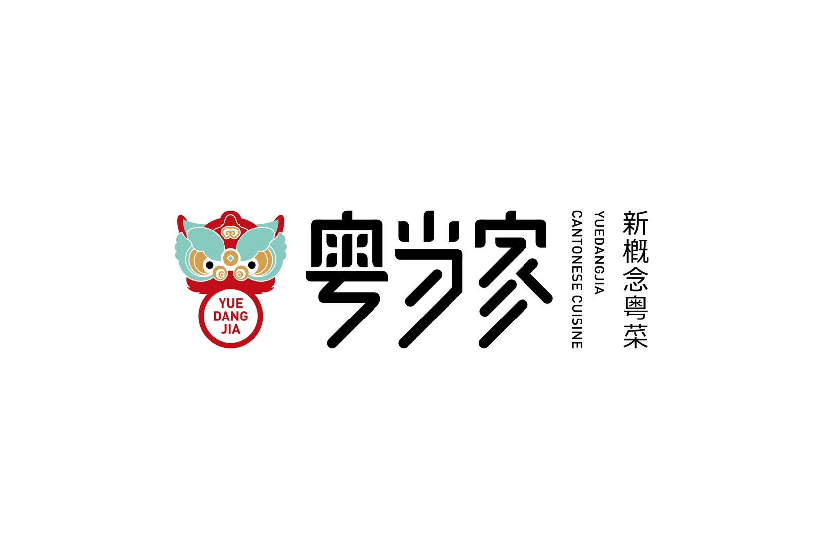
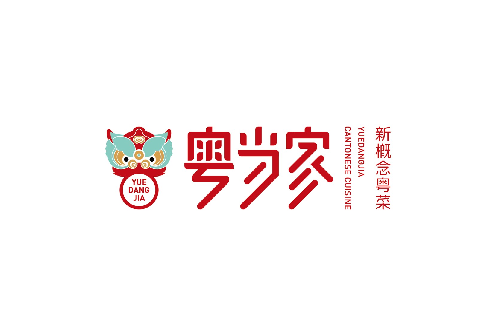
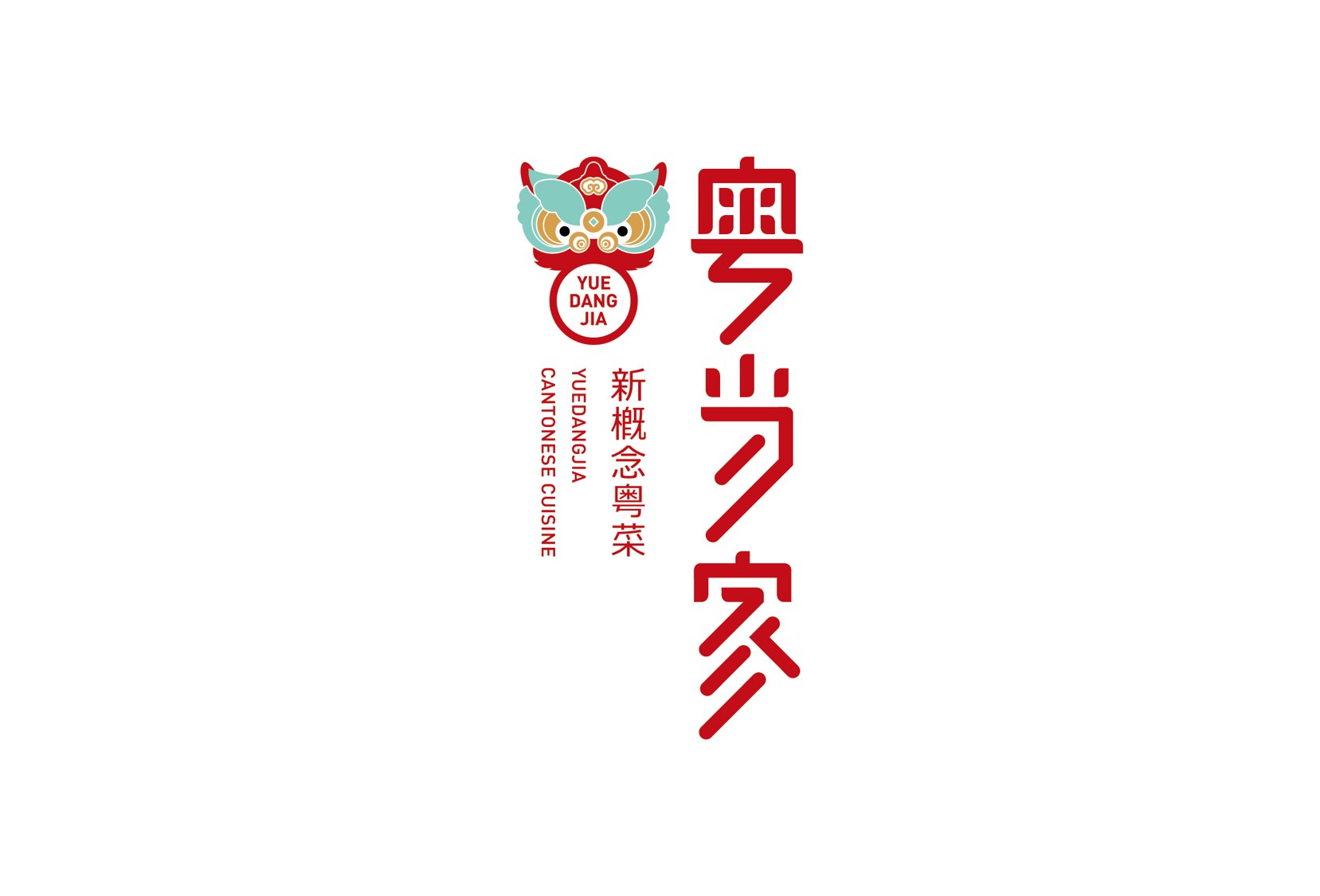
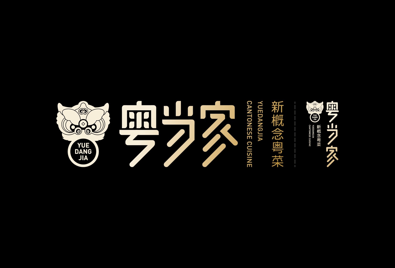
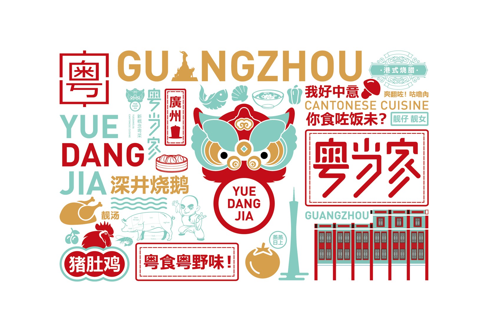
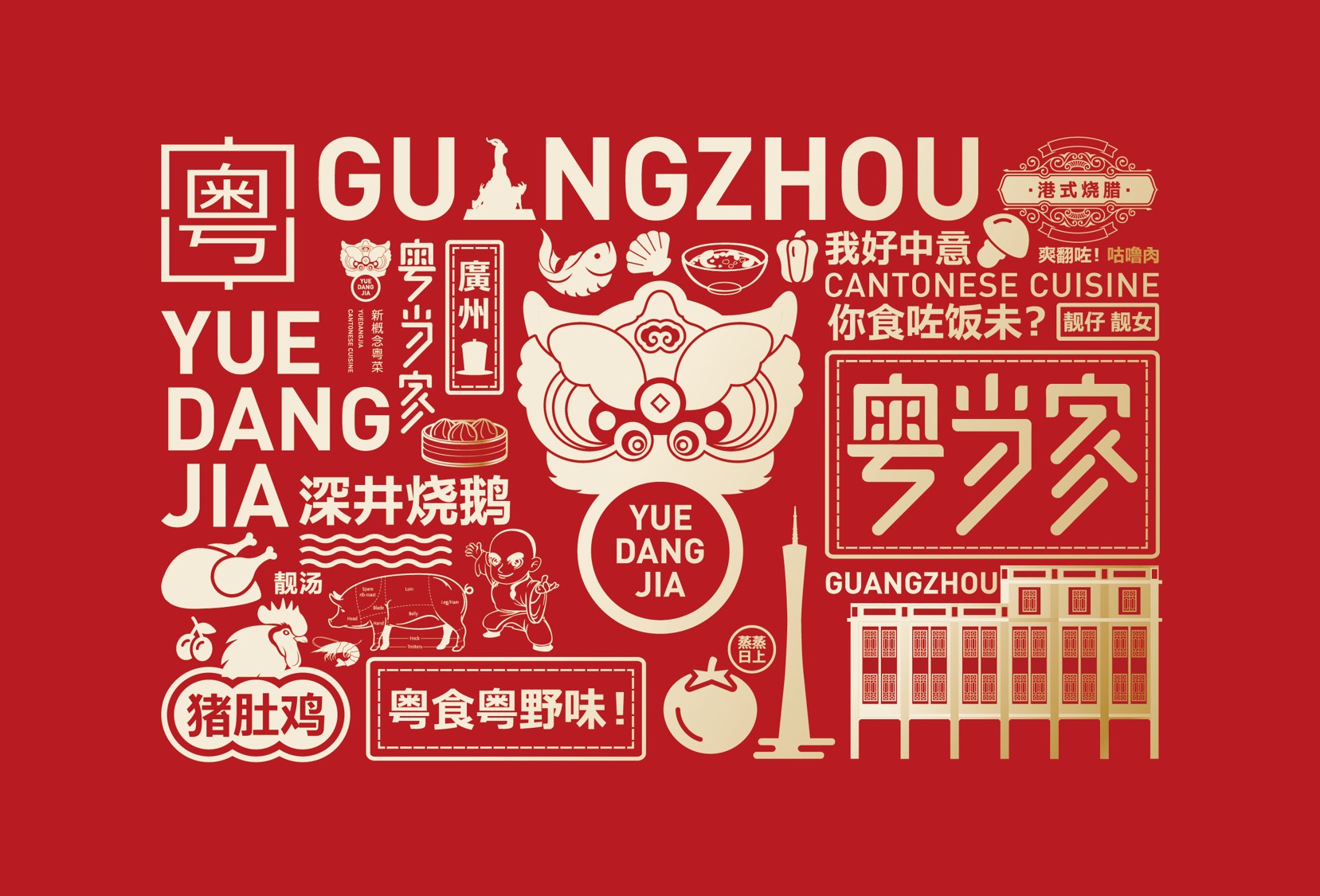
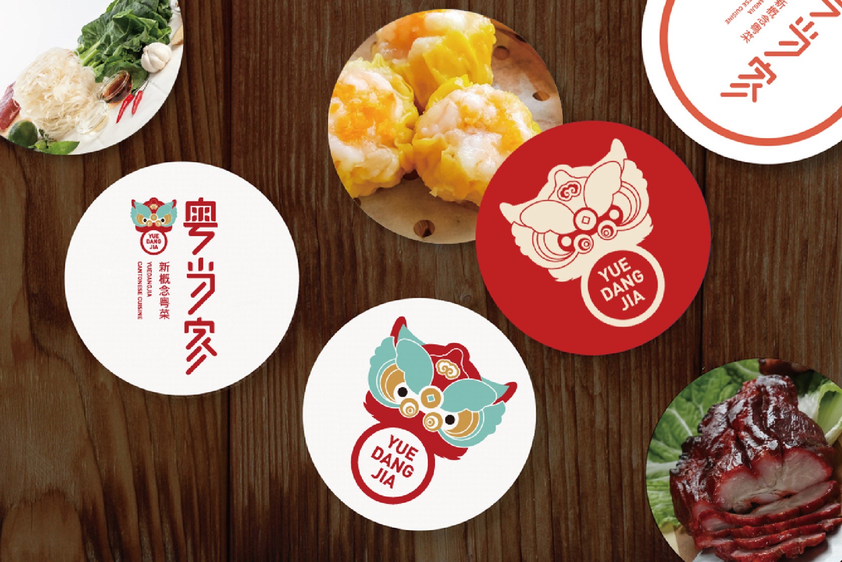
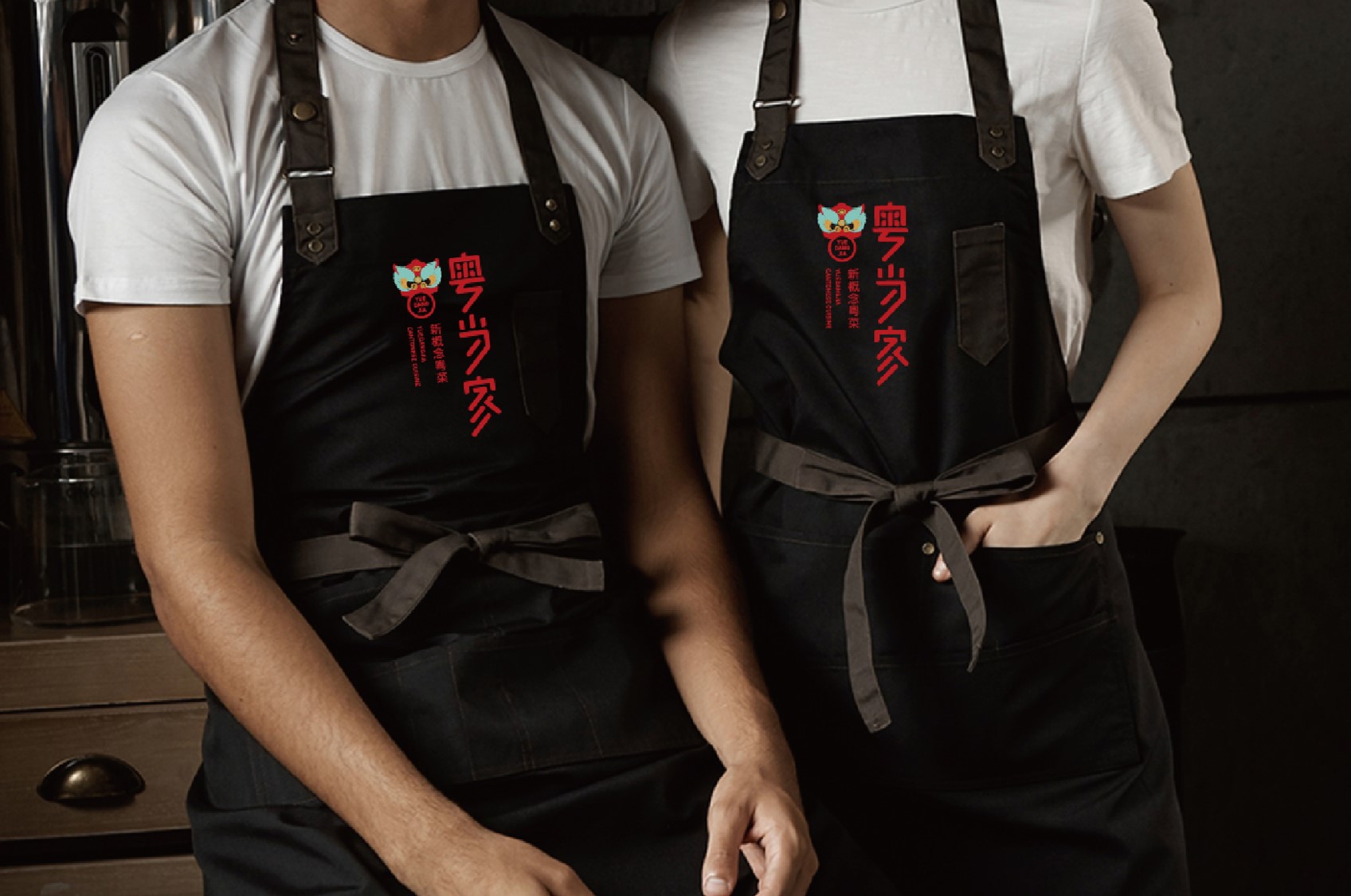
Dalian, China | Yue Dang Jia | Neo-Cantonese Cuisine (Restaurant)
Where the delicate charm of Lingnan culture meets the majestic coastline of Northeast China.
Where timeless aesthetics intertwine with contemporary “Guochao” trends.
A symphony of color, aroma, flavor, artistry, and form.
A vibrant awakening lion dance leaps across the vast landscapes of the Northeast—
captivating eyes, tantalizing taste buds, and lingering in memories.

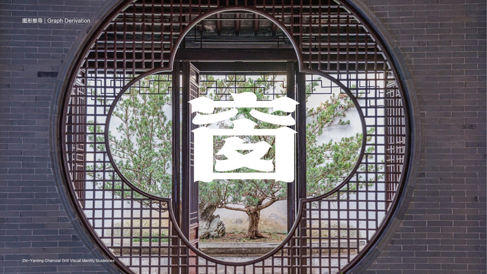
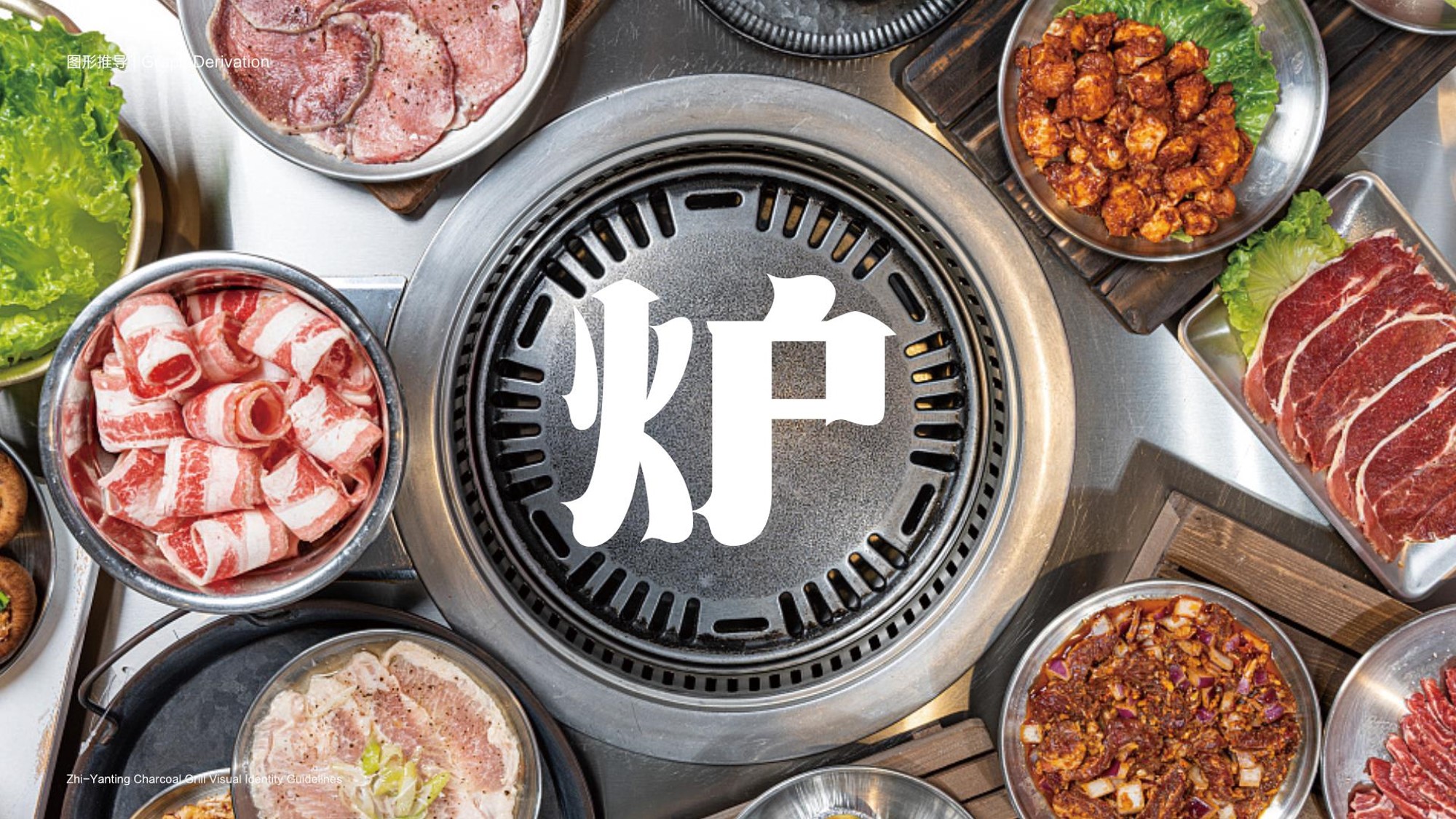
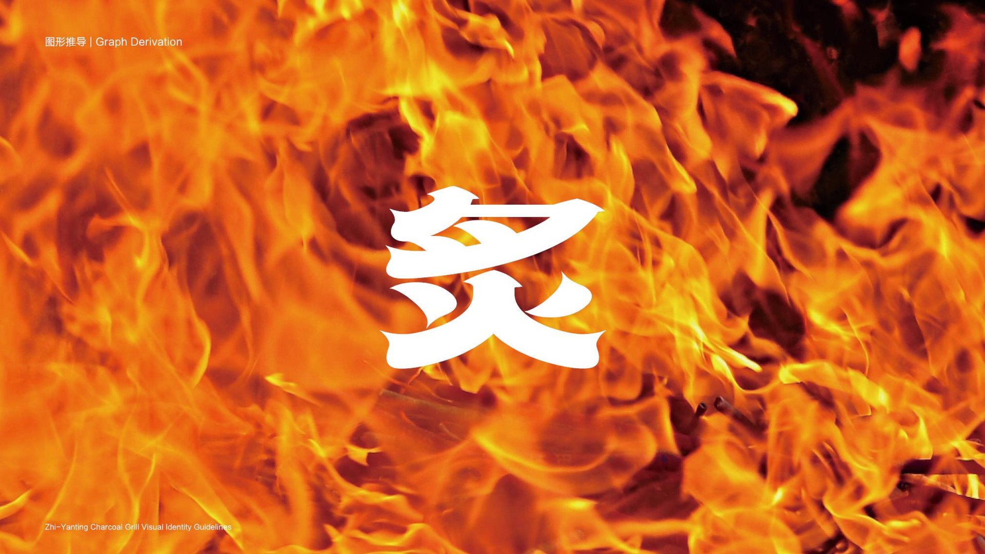
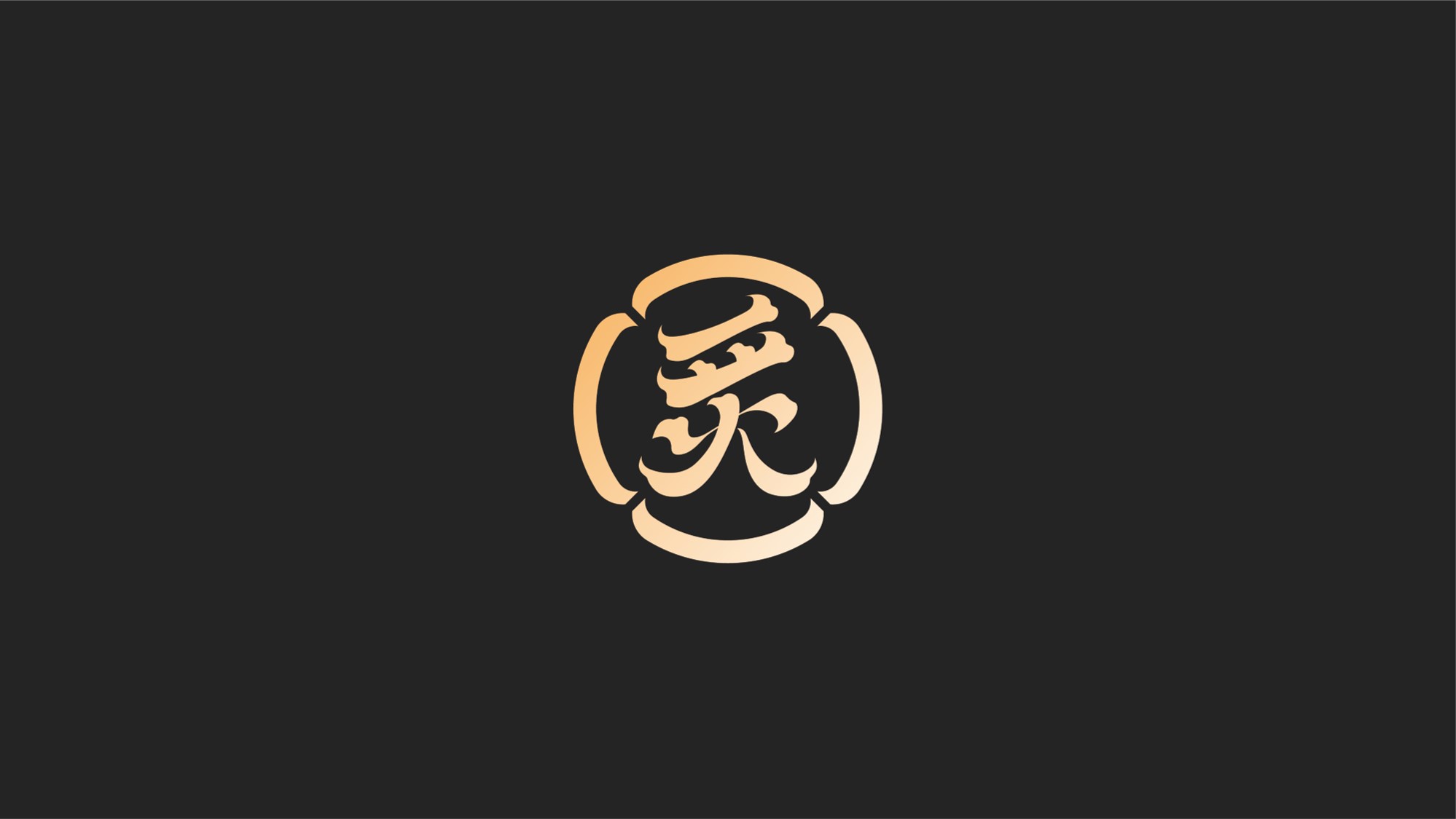
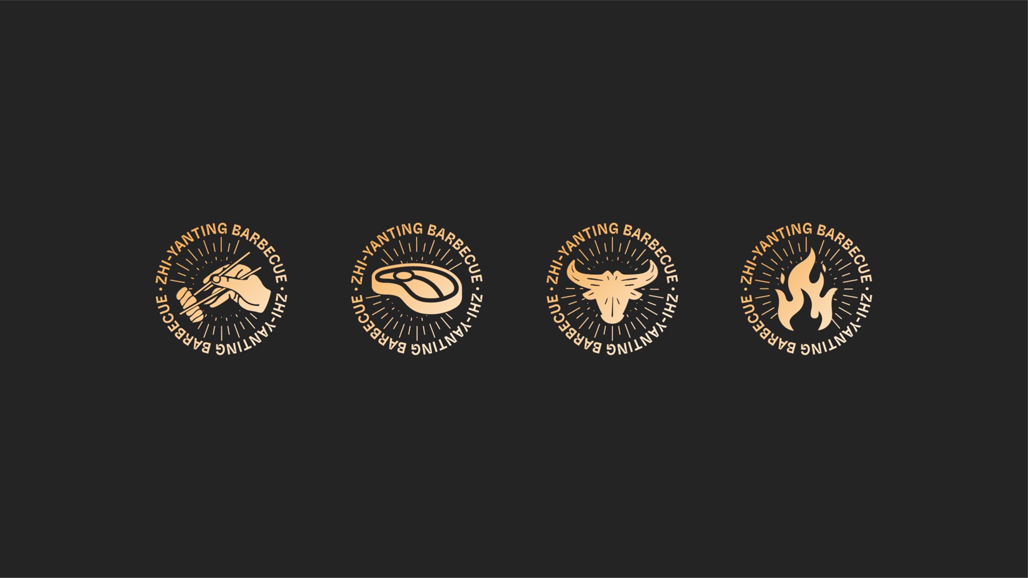
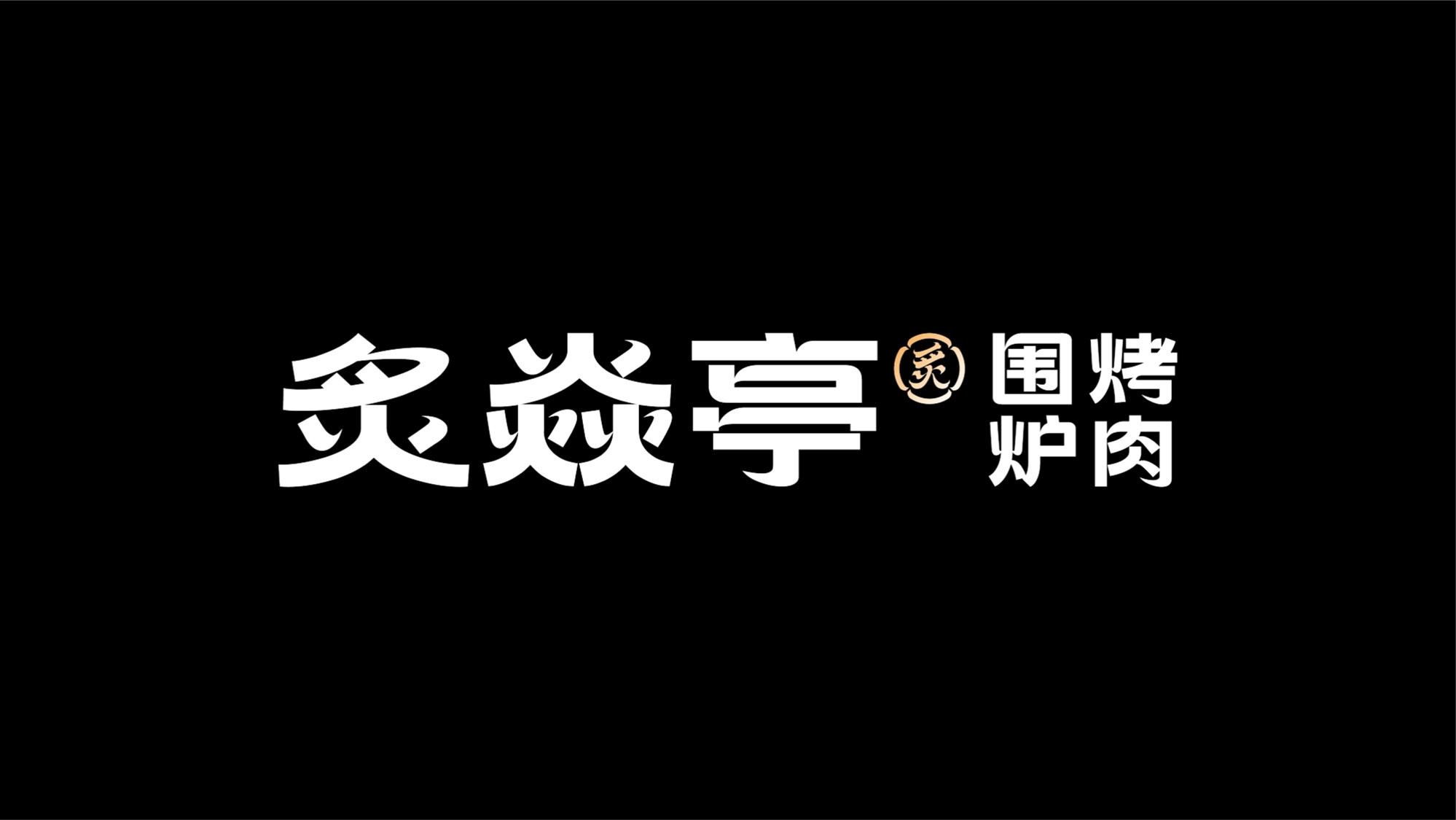
Dalian, China | Zhi Yan Ting • Premium Charcoal Grill | Artisanal BBQ at Your Doorstep (Restaurant)
Zhi Yan Ting is an upscale grill-centric restaurant tailored for discerning clientele—offering an elevated dining experience for business banquets, social gatherings, and private celebrations.
Design Concept: “The Golden Age of Tang Dynasty”
- Aesthetic: “Guochao Tang-Style” interiors fuse imperial grandeur with modern vibrancy.
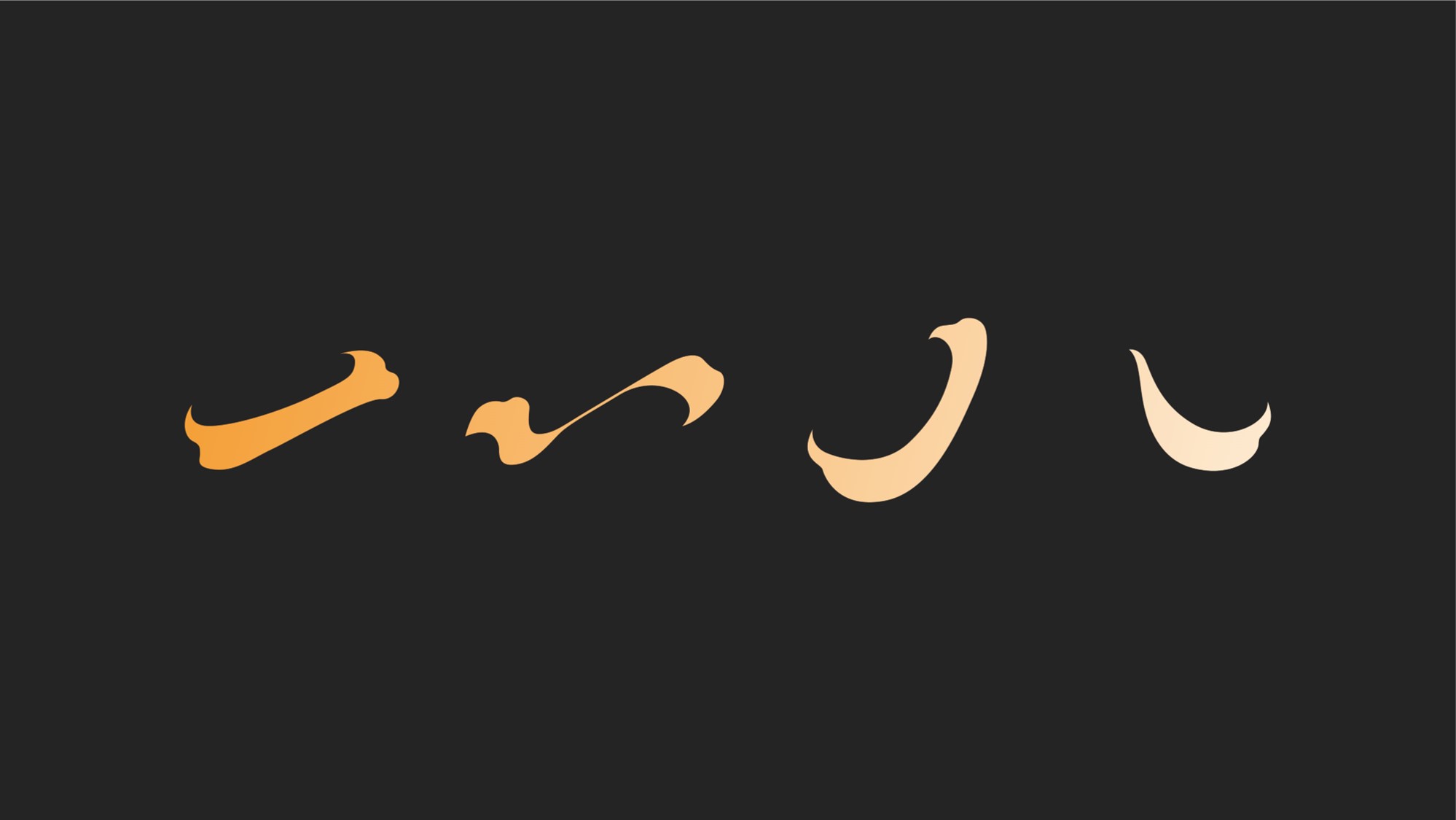
- Brand Symbolism: The logotype “炙” (zhì, “searing heat”) is crafted from Tang-inspired calligraphy and flame motifs, mirroring both the art of grilling and Tang dynasty lattice patterns. Four encircling chairs evoke communal feasting and traditional window designs, blending culture with conviviality.
Key Narrative: “Where the legacy of China’s golden age meets the sizzle of contemporary craftsmanship—every bite tells a story.”
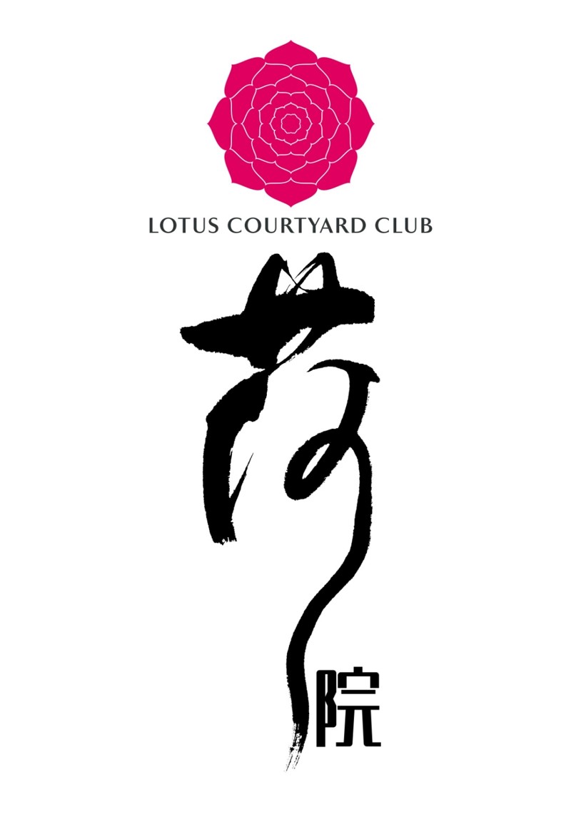
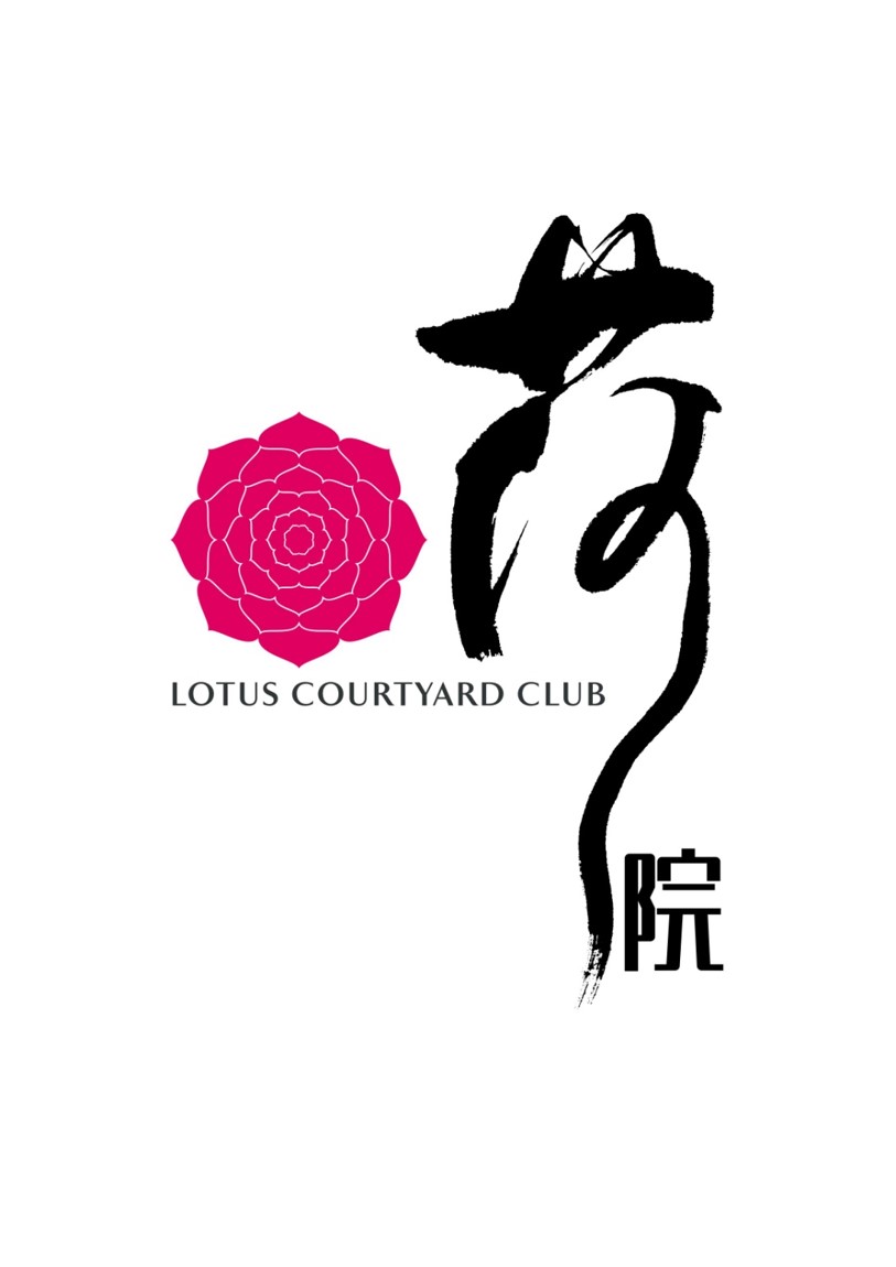
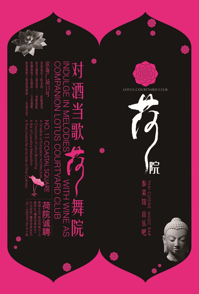
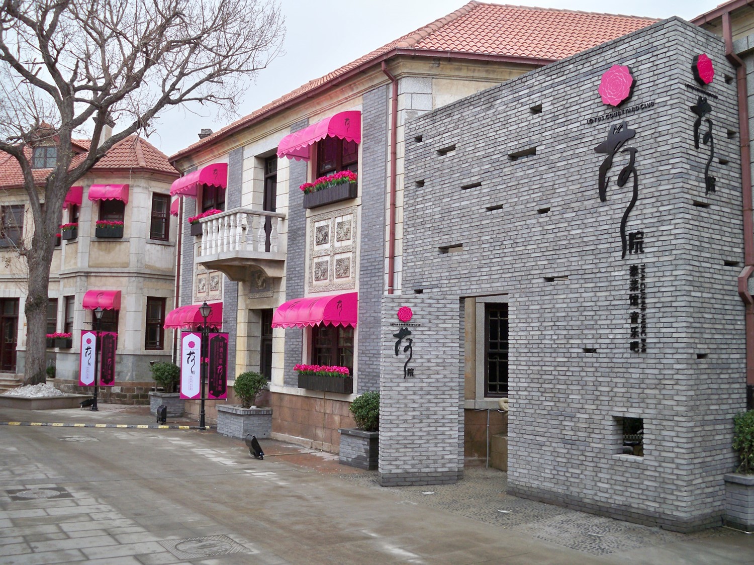
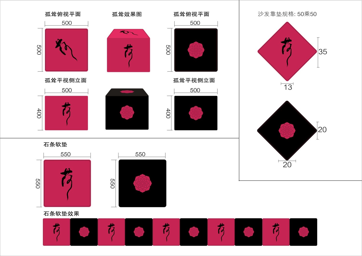
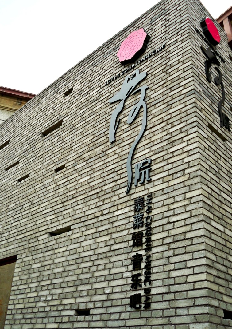
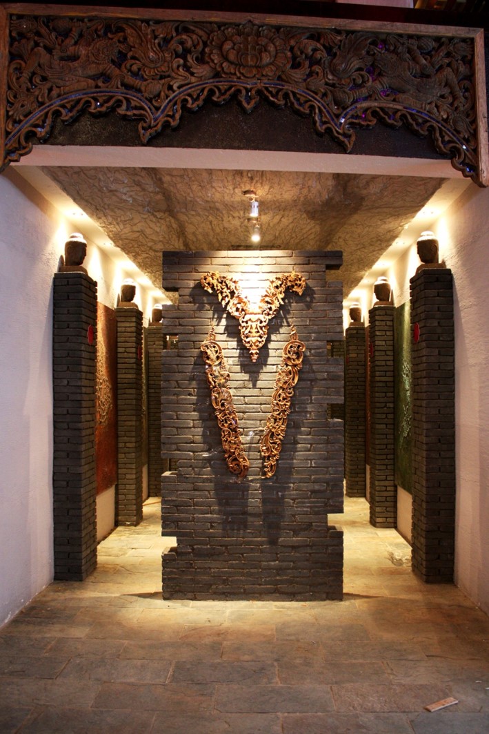
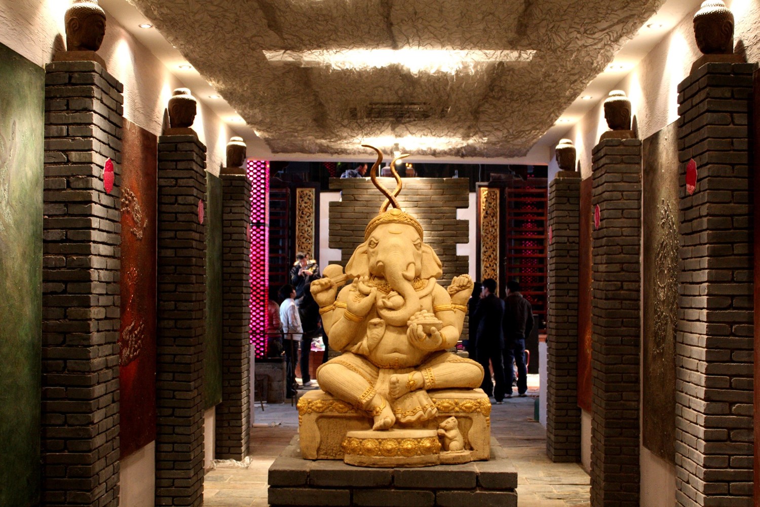
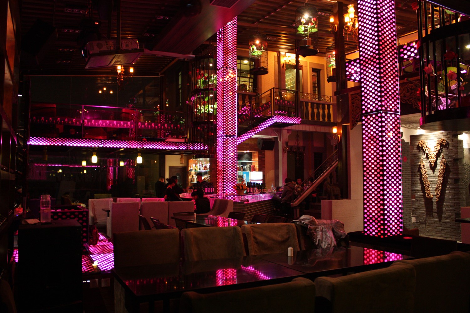
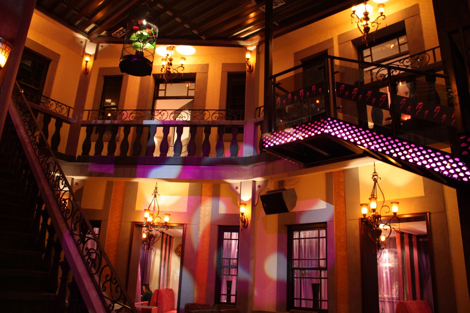
Yantai, China | Lotus Court • Neo-Zen Thai Cuisine (Restaurant)
Heyuan is located in the old villa area by the seaside of Yantai. In Western architectural spaces, a large number of Thai art elements are used for decoration, which is a fusion of spatial styles; In the brand design, we did not emphasize the original flavor of Thai cuisine, but instead integrated Buddhist Zen, Chinese culture, and Thai culture again, such as using a combination of Chinese calligraphy characters and Thai red lotus flowers. Targeting high-end customers, resonate and empathize with artistic taste and emotional realm.
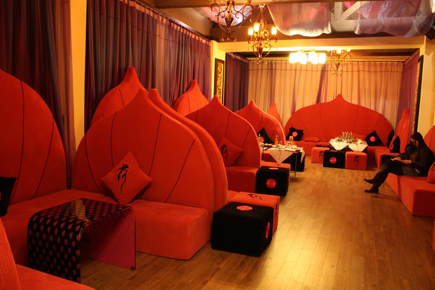
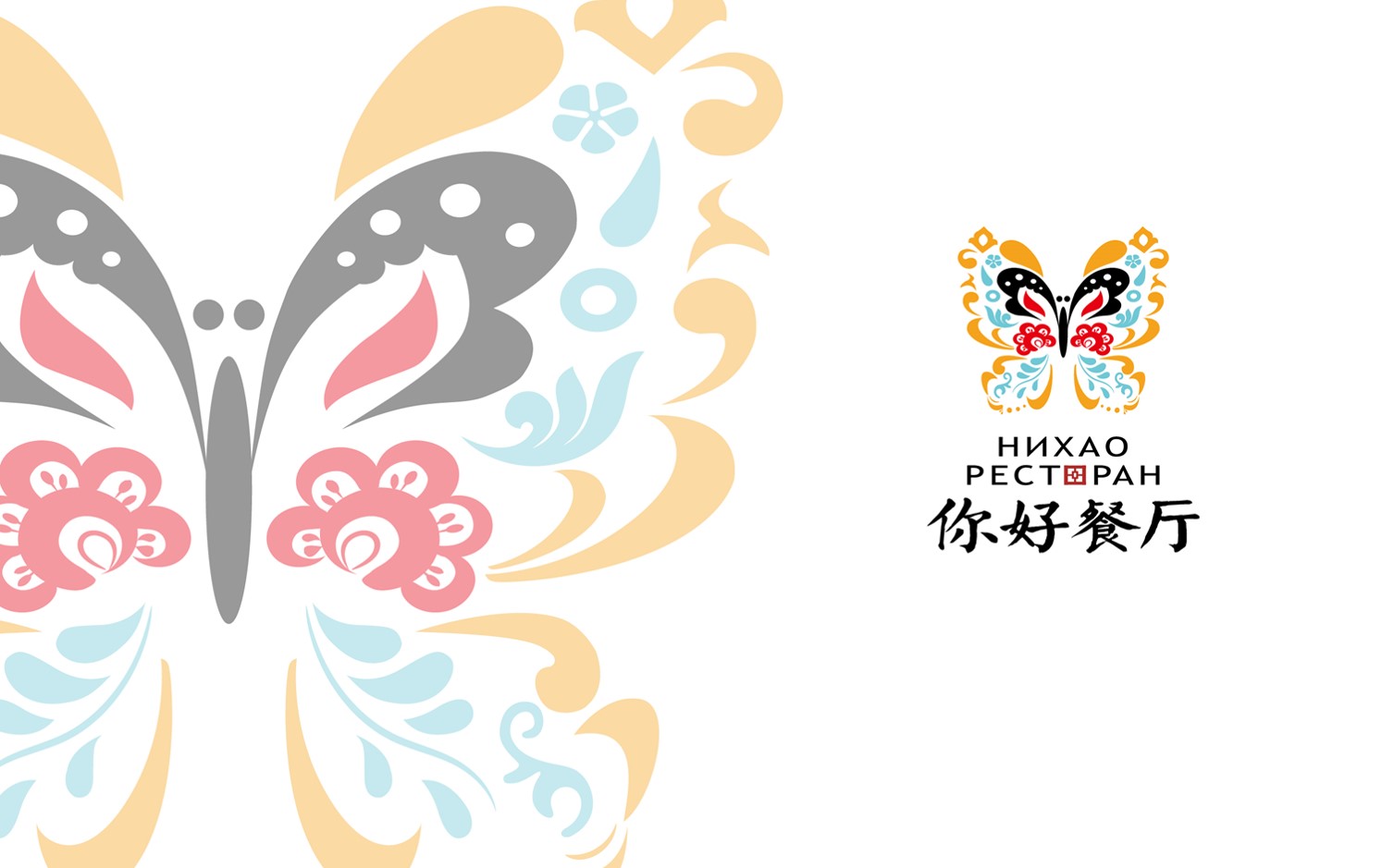
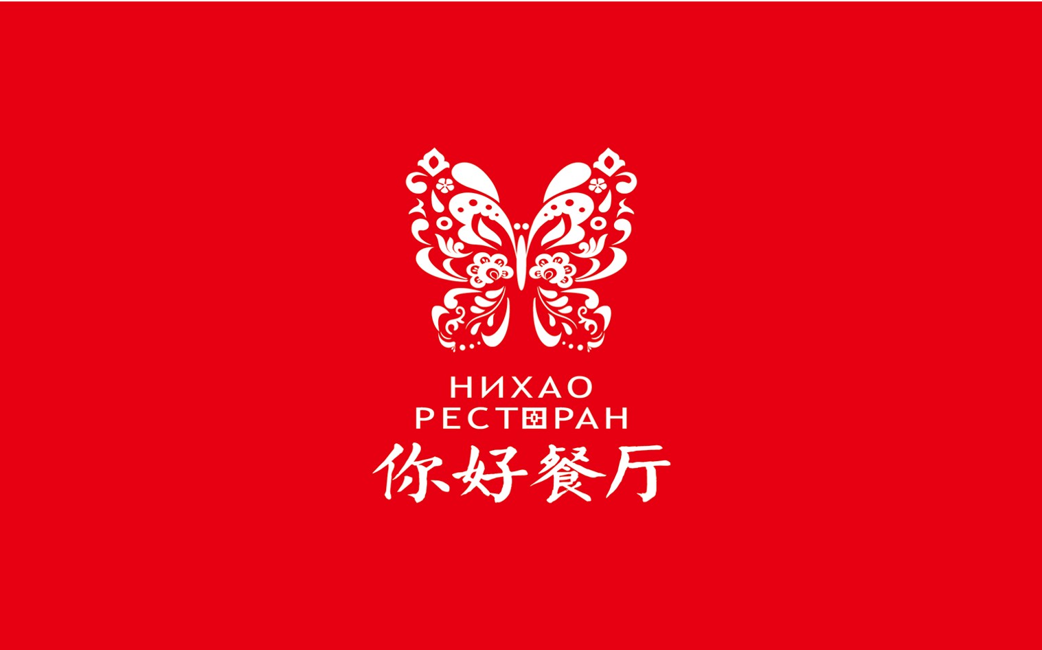
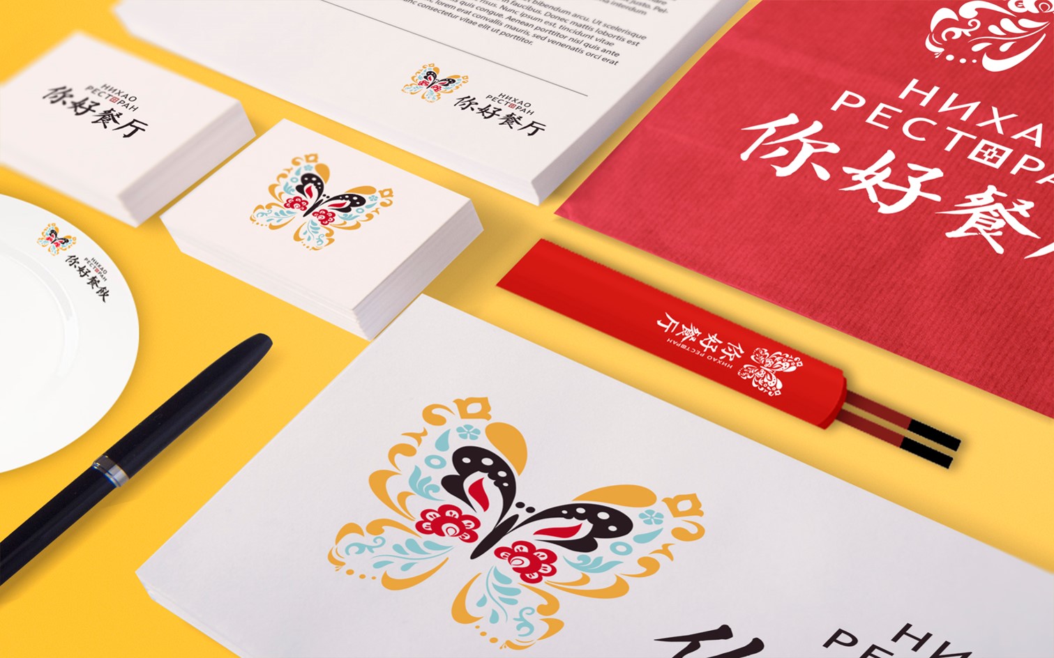
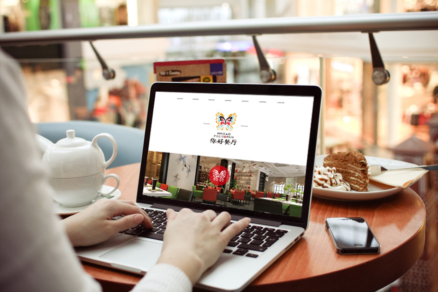
Vladivostok, Russia | NIHAO Restaurant • Where Culinary Cultures Converge (Restaurant)
As a Chinese restaurant located overseas, it is necessary to preserve unique Chinese flavors and elements while also catering to the aesthetic and regional characteristics of local customers. This is a collision of time, space, and culture. The butterfly is a typical symbol of friendship and greetings in Russia, and the pattern of butterfly wings is derived from the facial makeup art of Chinese Peking Opera, combined with the combination of Chinese store names in calligraphy and Russian, seamlessly blending and complementing each other, giving the audience a strong visual memory.
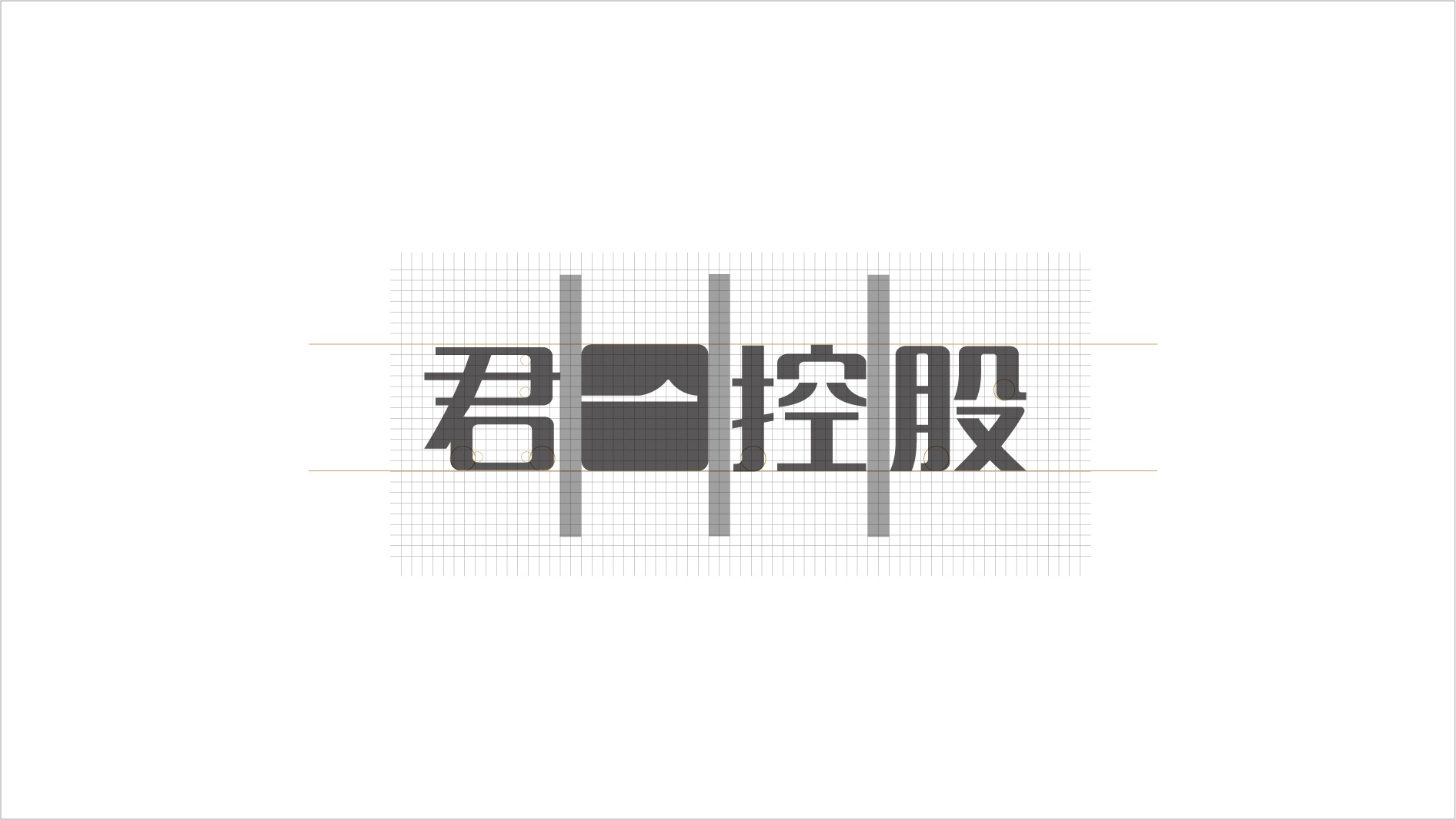
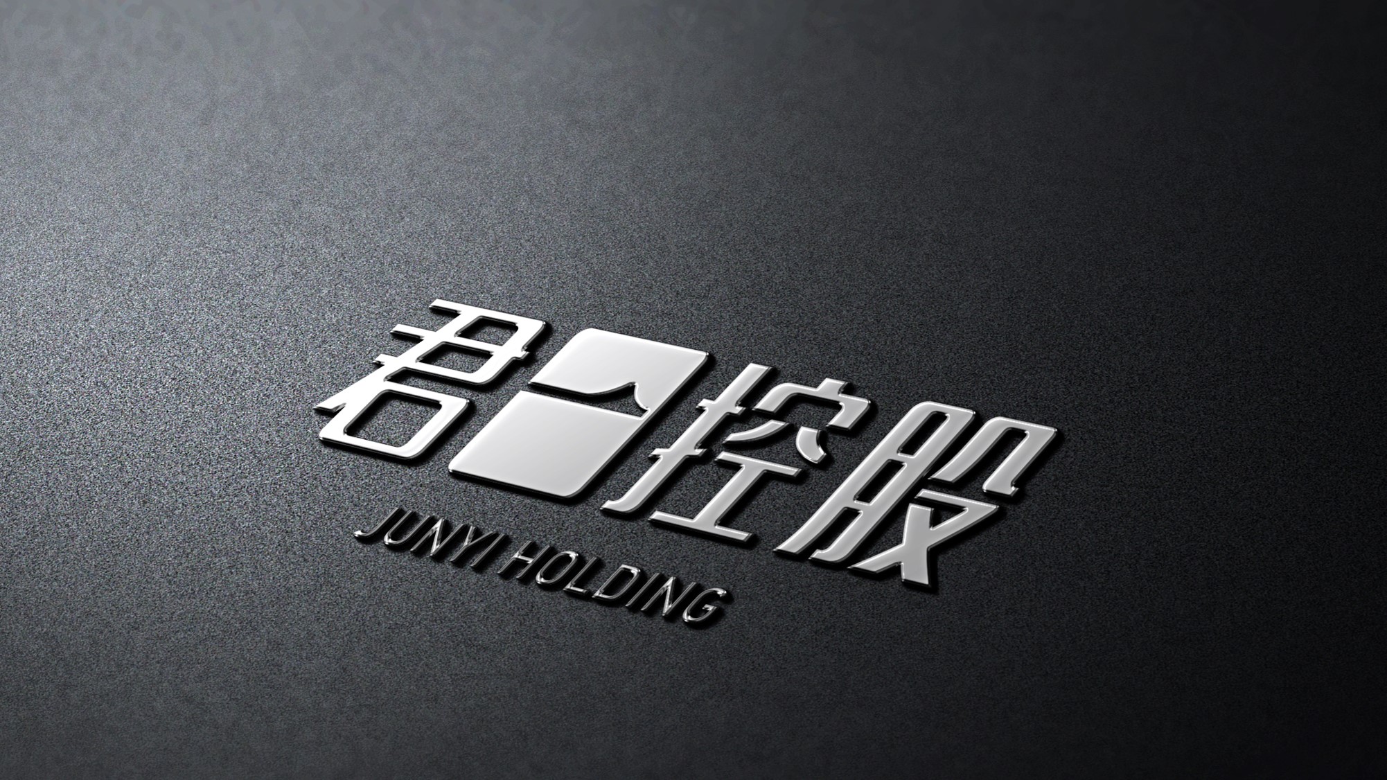
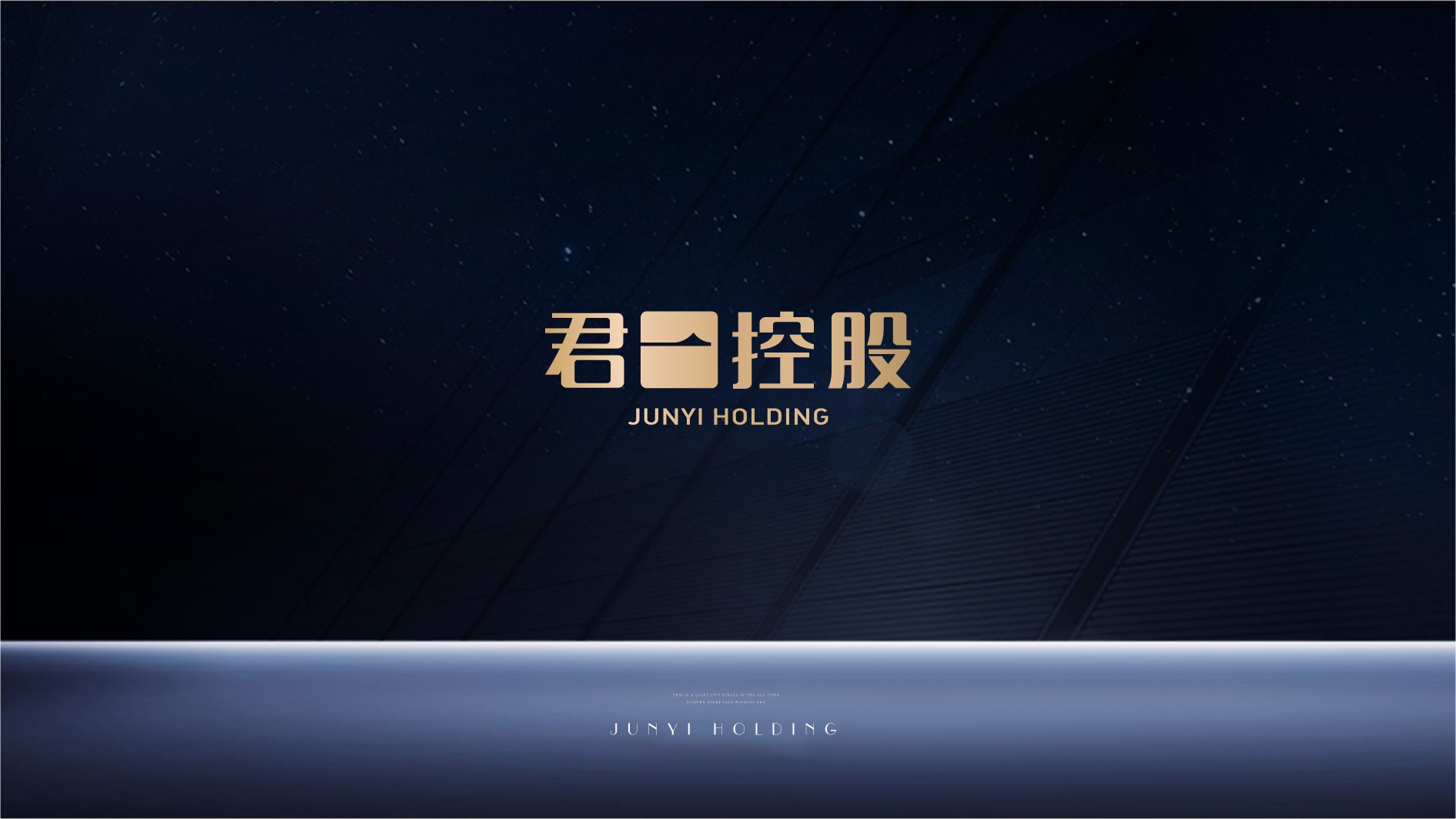
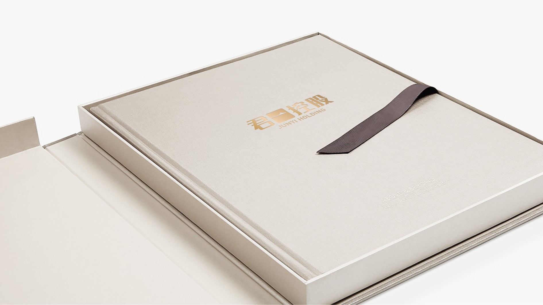
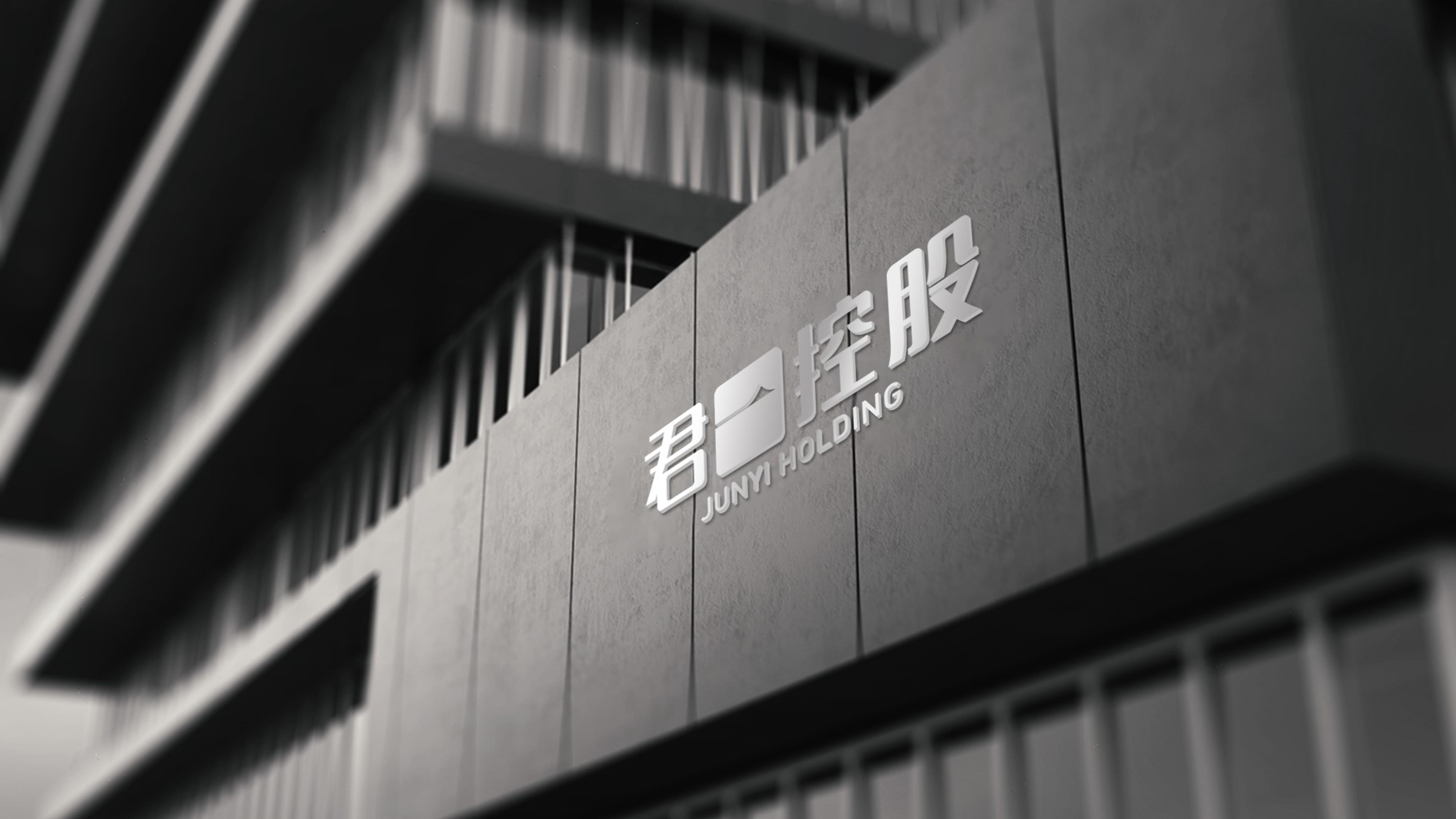
Qingdao, China Ι Junyi Holdings (Real Estate)
Junyi Holdings is the new name of Haier Real Estate after equity restructuring, corresponding to the establishment of a new brand image, which not only inherits the reputation and purpose of the original brand, but also highlights the new spirit of the new brand in the new era.
The new VI system, with solemn Chinese characters as the main body, cleverly utilizes the contrast between the complexity and simplicity of characters, and draws on the Yang and Yin carving techniques of Chinese seal carving art, thus solving the problem of excessive contrast in character strokes and establishing a unique brand tone.

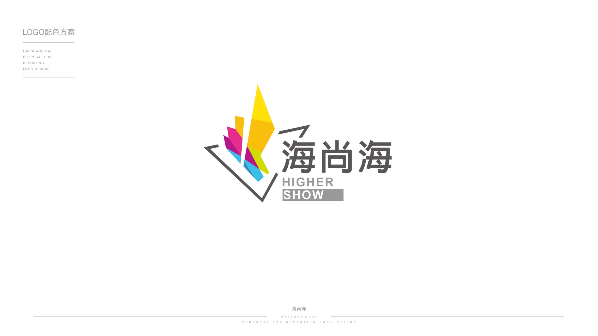
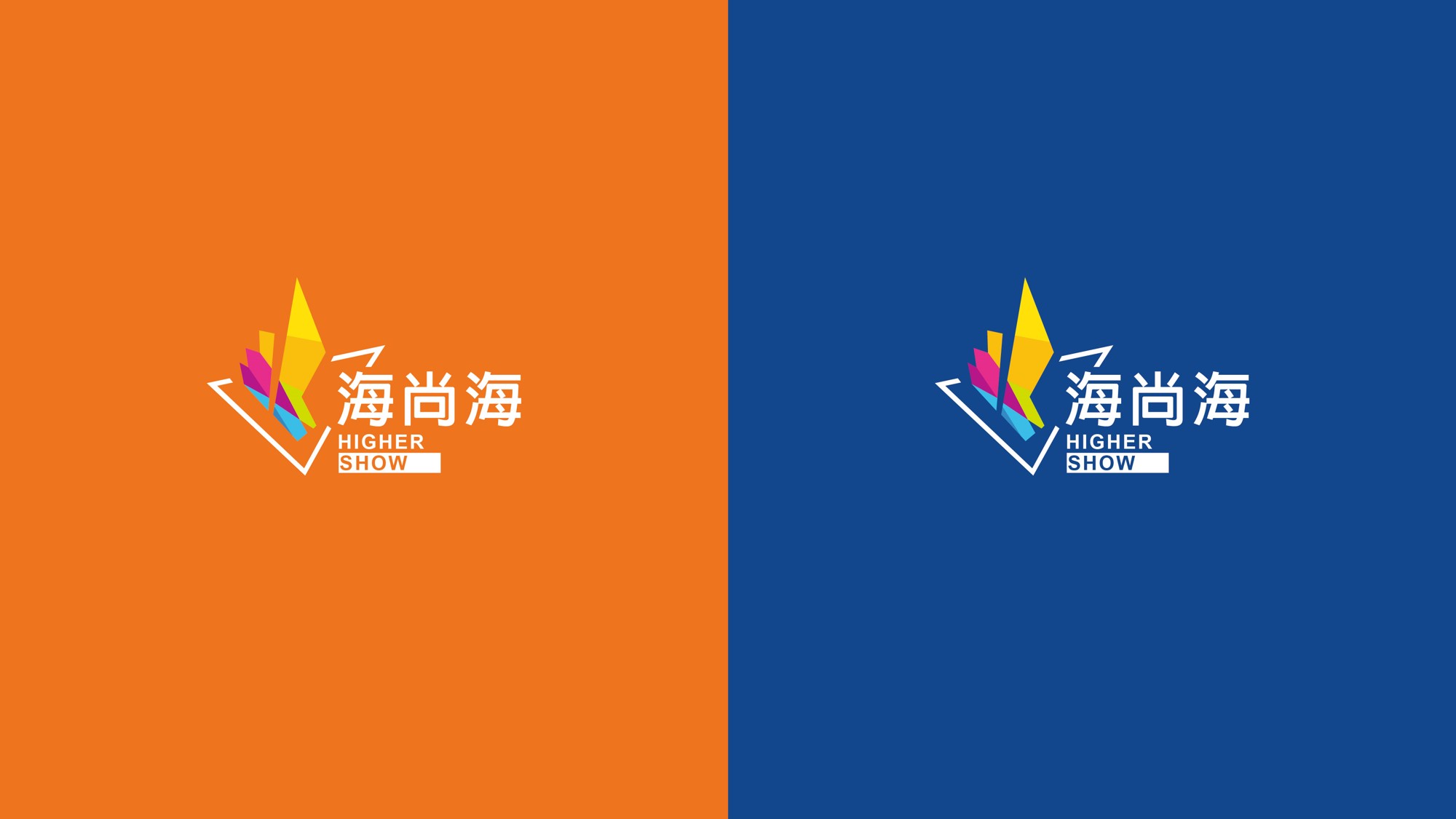
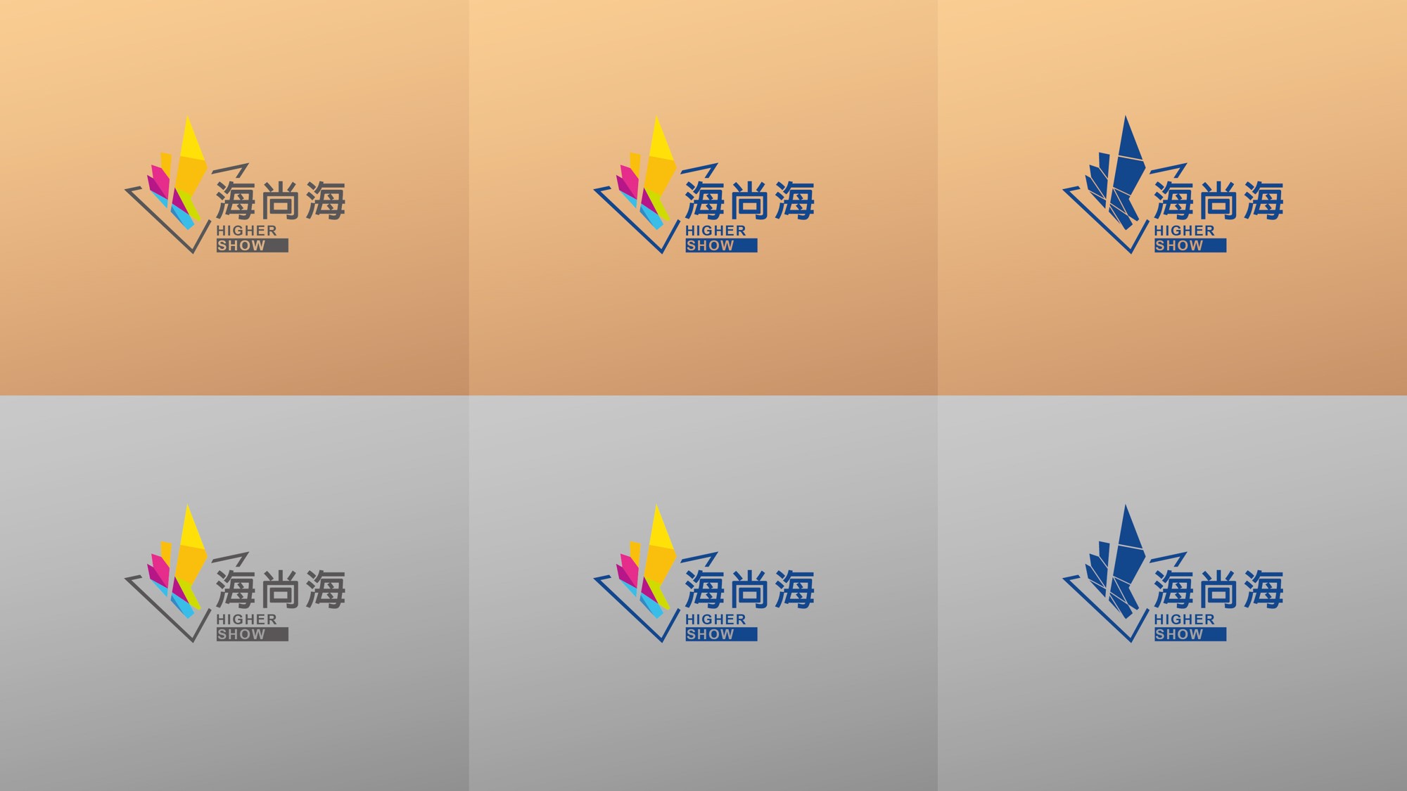
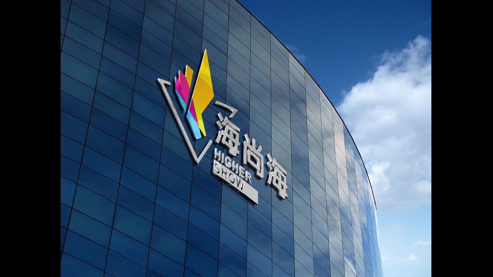
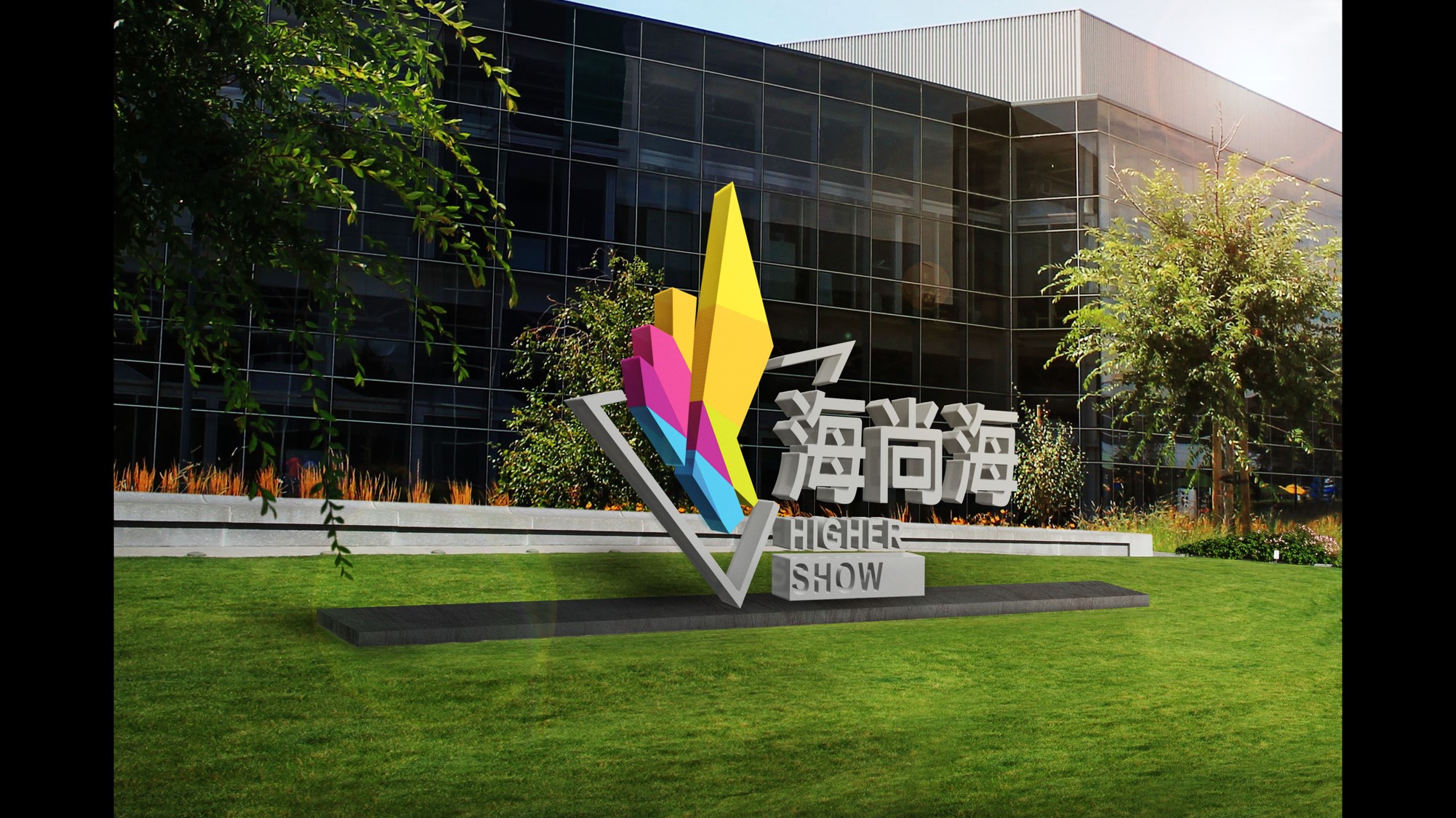
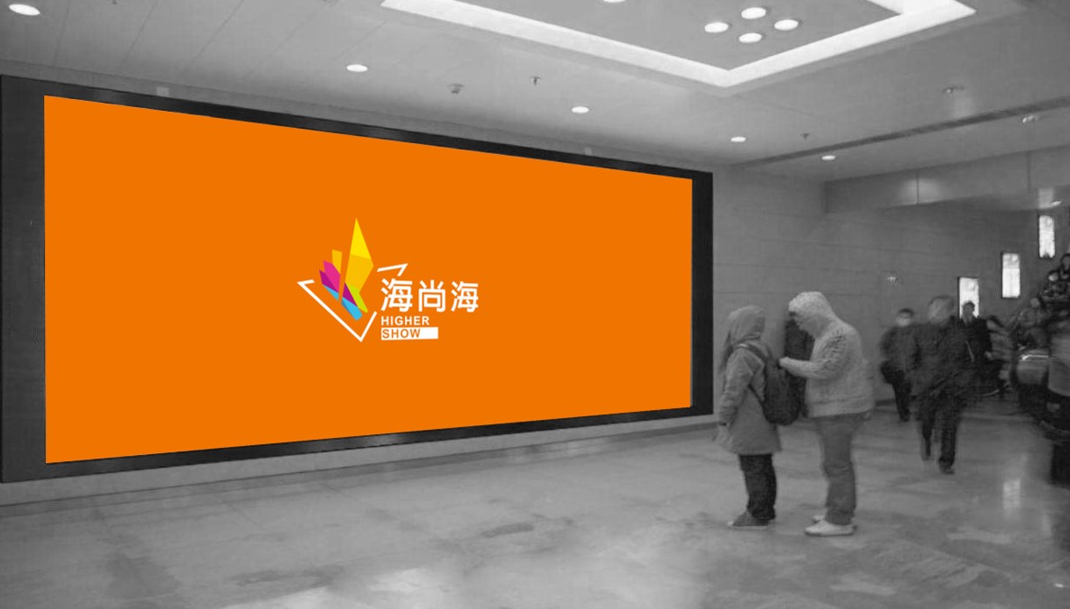
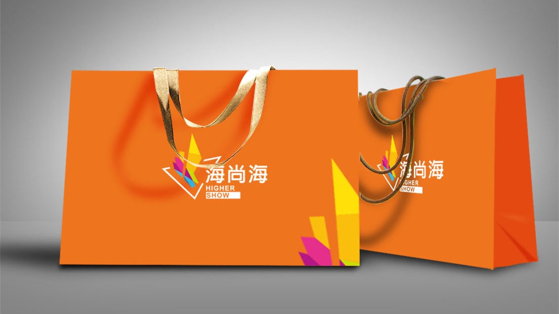
Qingdao, China Ι Haishanghai Service (Property)
Haishanghai is a new type of property management company under Haier Real Estate. Compared to traditional property management companies, it focuses more on the linkage of online and offline services, as well as the attraction and customer stickiness in the digital age.
The brand image is based on tangram and sailboat elements, symbolizing colorful services and the brand spirit of setting sail and braving the wind and waves.
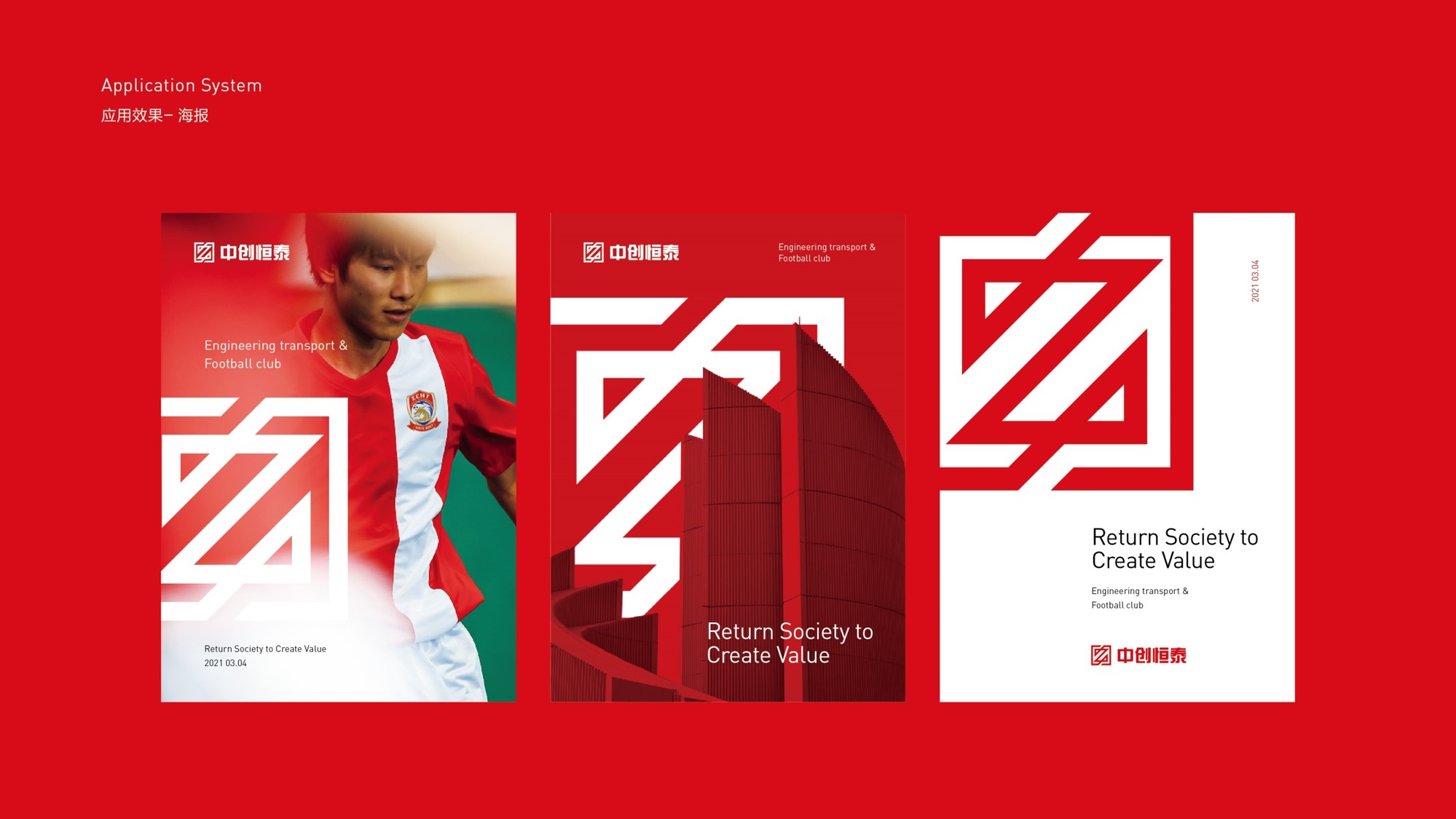
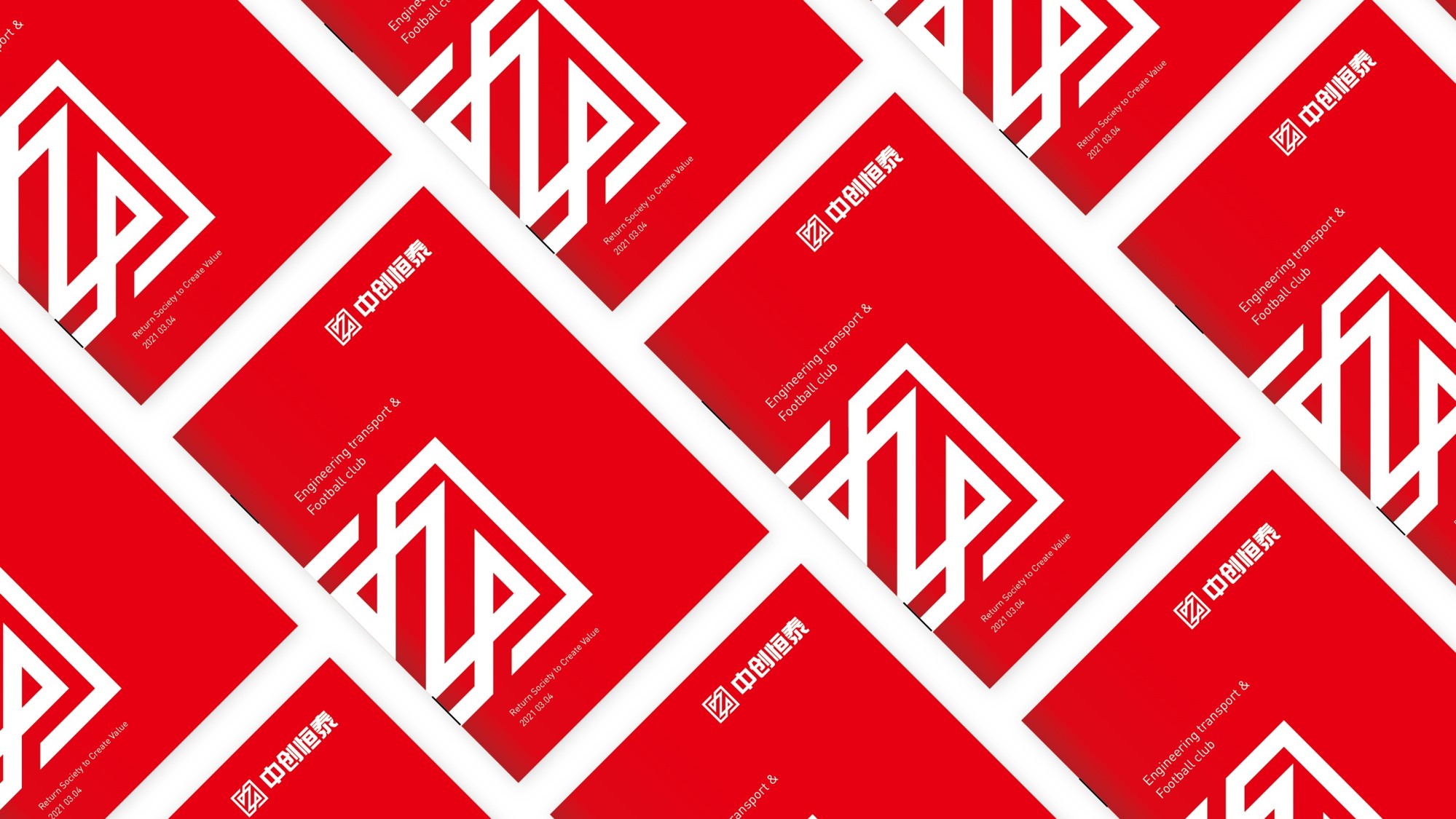
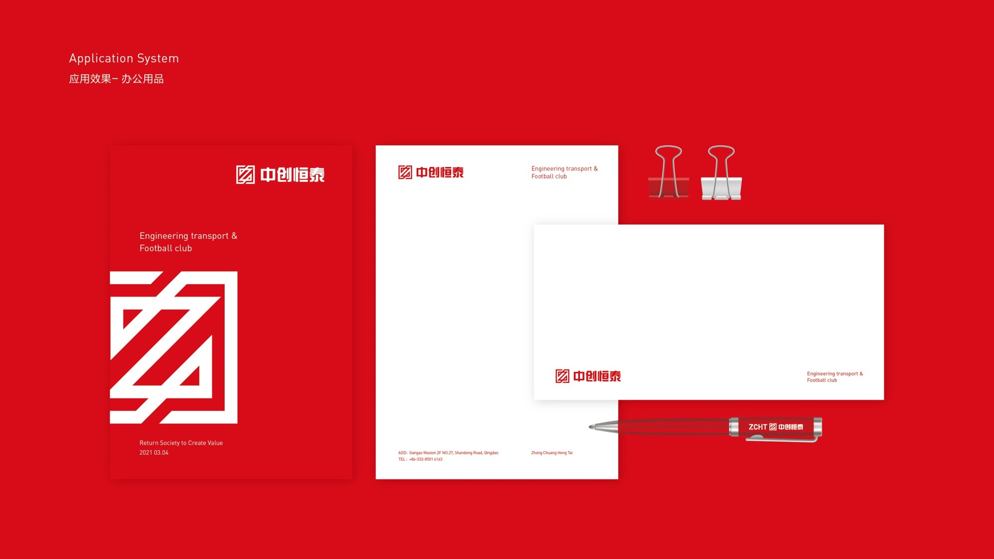
Shandong, China Ι Zhongchuang Hengtai Group (Comprehensive)
Zhongchuang Hengtai Group was originally a construction industry enterprise. After the restructuring of its business strategy, it has transformed into a cross industry comprehensive and platform based group company.
The transformation is accompanied by a new corporate brand image, which is neutral, atmospheric, and full of rhythm and change. The different combinations of Chinese and English also lay the foundation for the company to carry out overseas business.
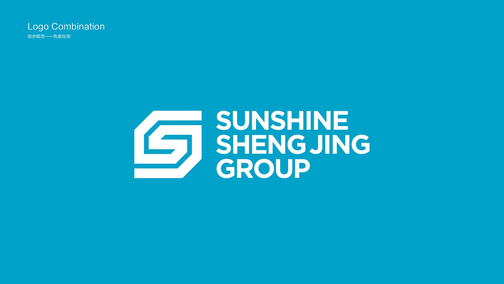
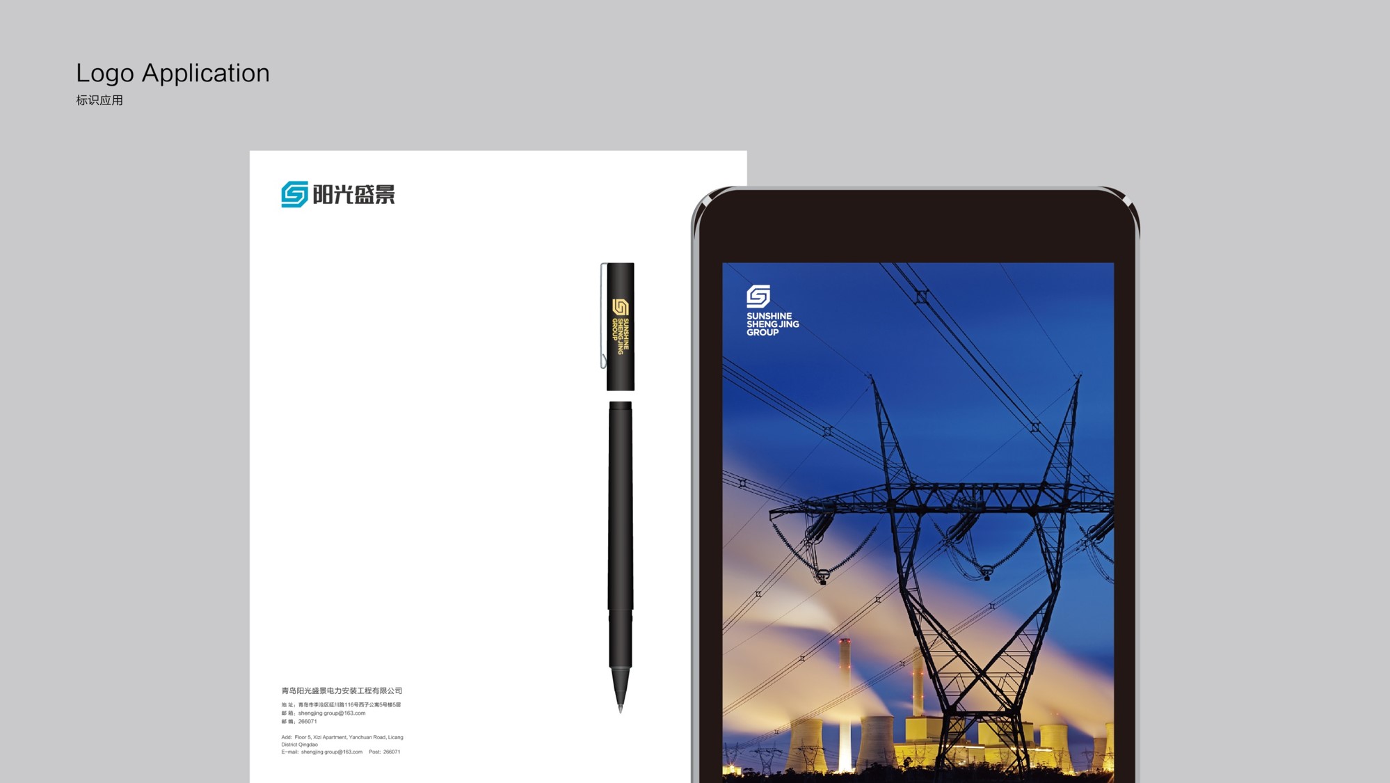
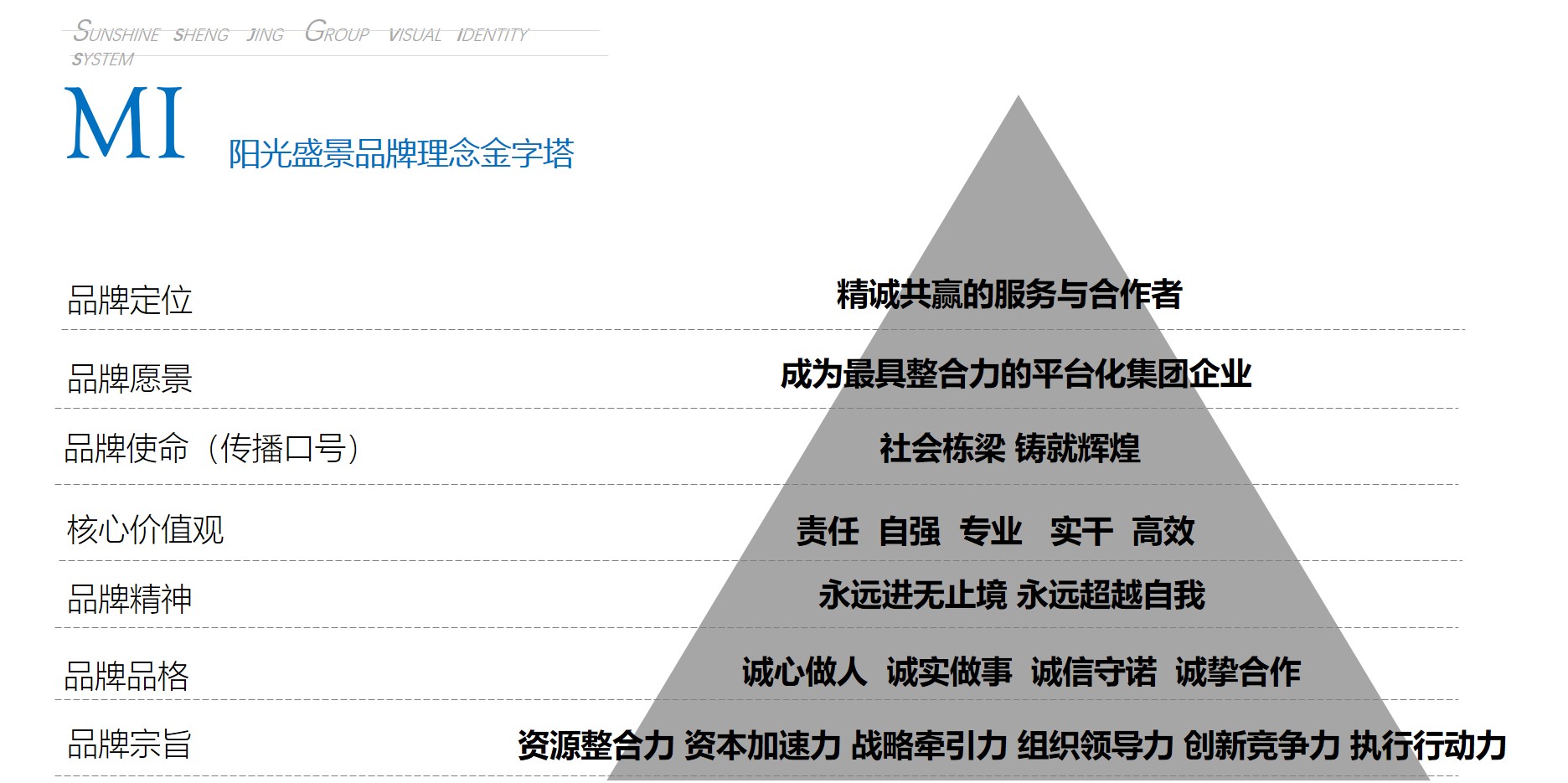
Shandong, China Ι Sunshine Shengjing Group (Electric Power)
Sunshine Shengjing Group is affiliated with the power industry, so in the design of its brand image, it fully considers highlighting its industry attributes, as well as highlighting the company’s own brand spirit and core competitiveness.
This plan first establishes the brand’s MI system (concept recognition), and then on this basis, forms the VI system (image recognition).
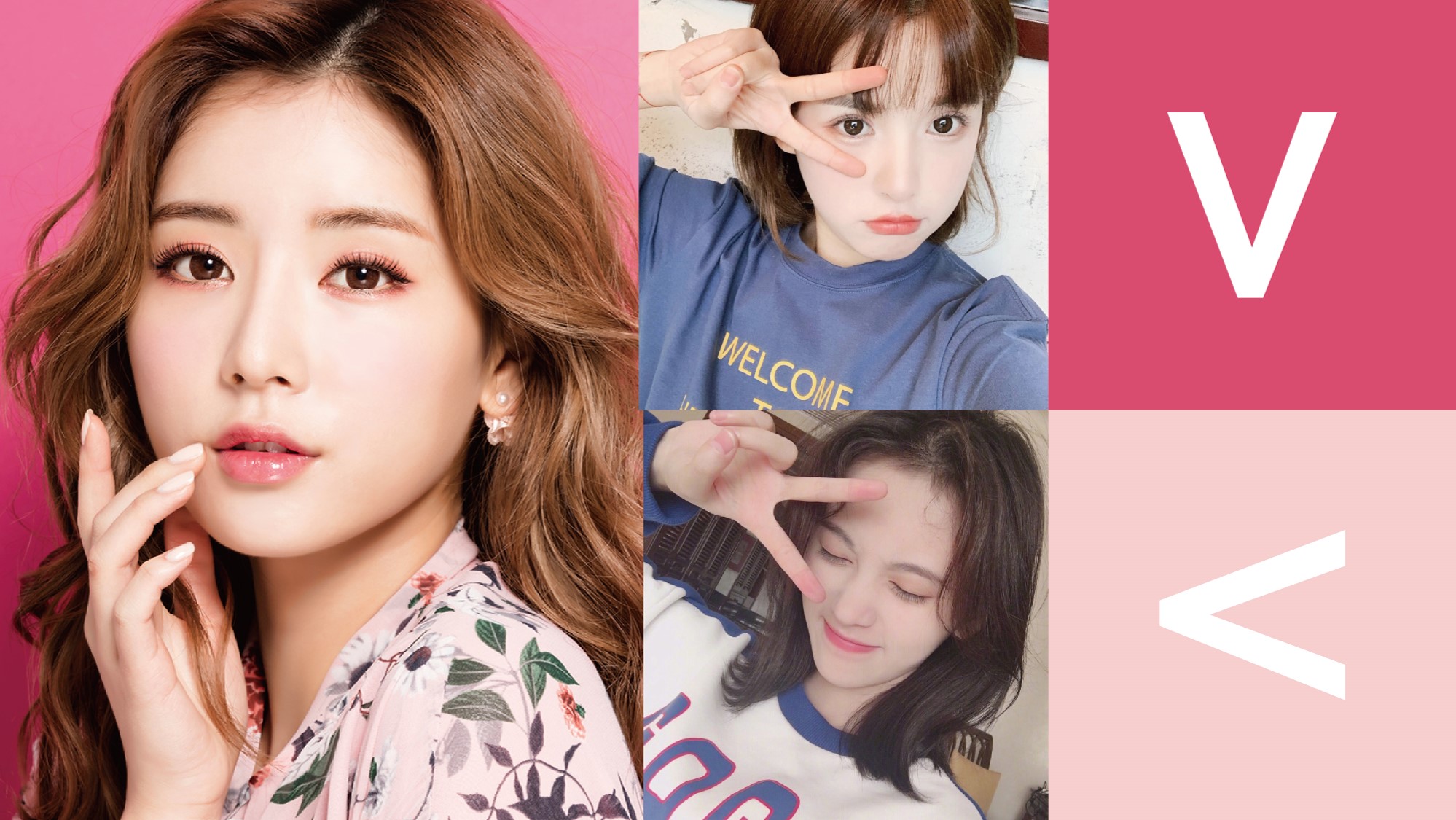
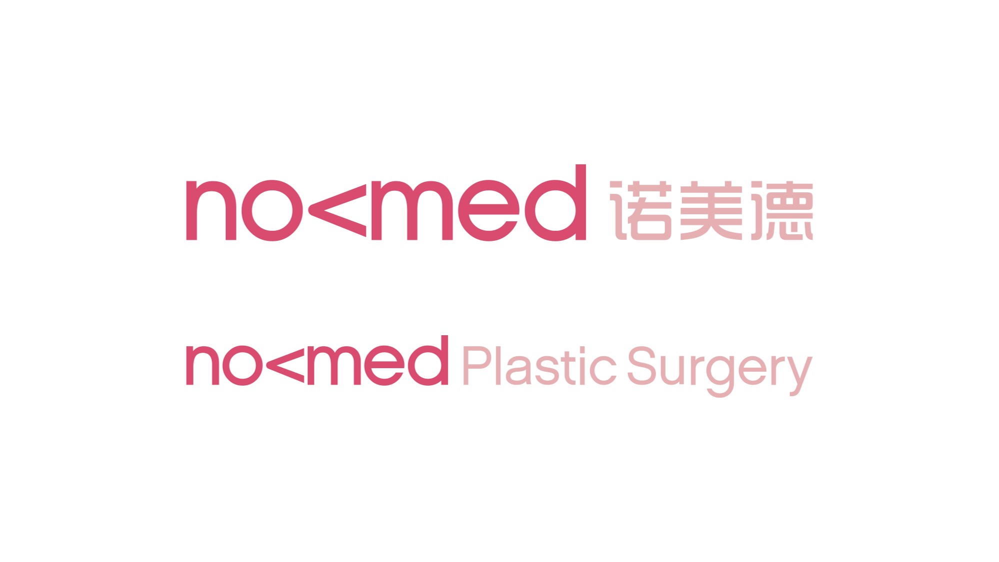
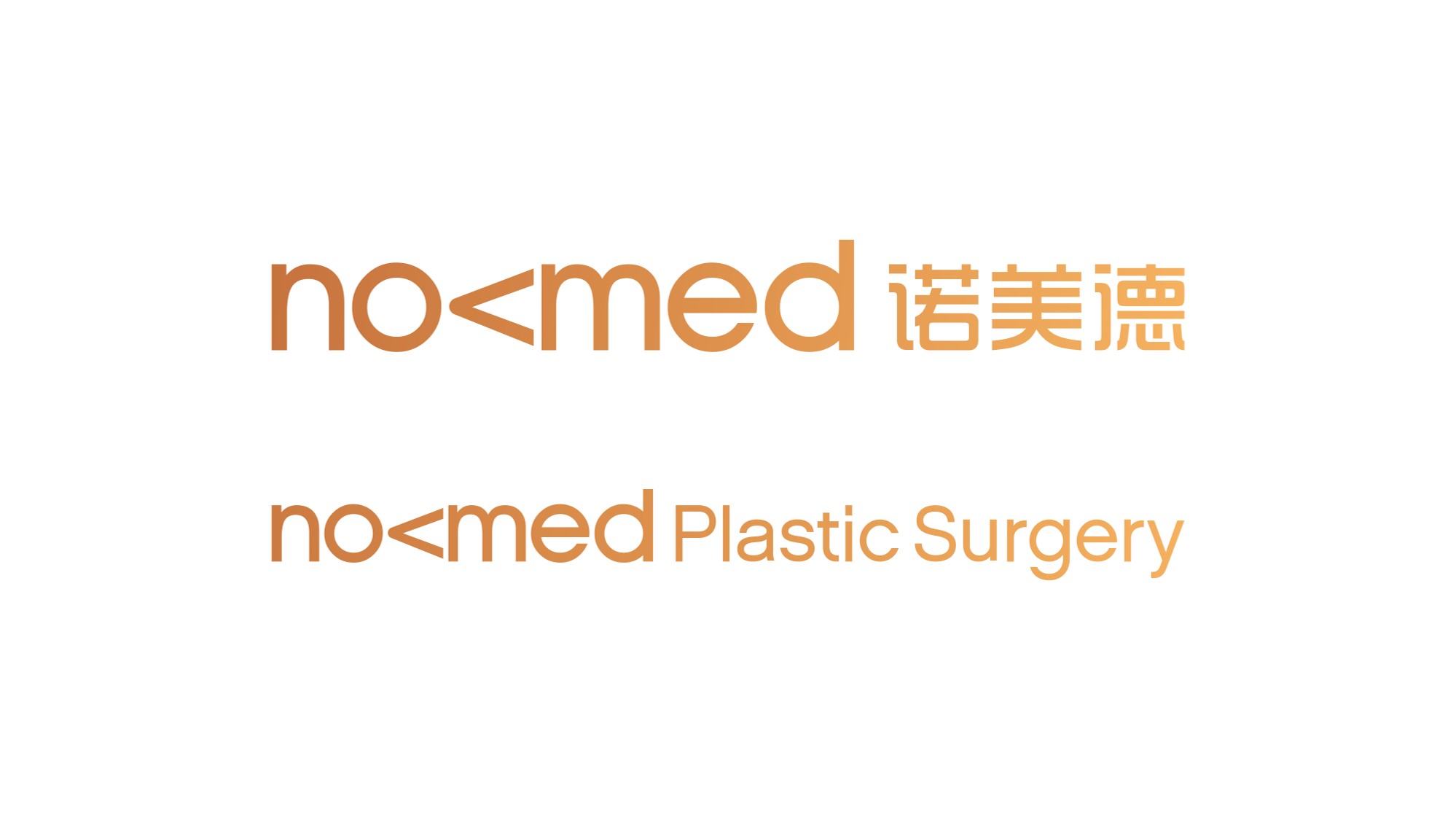
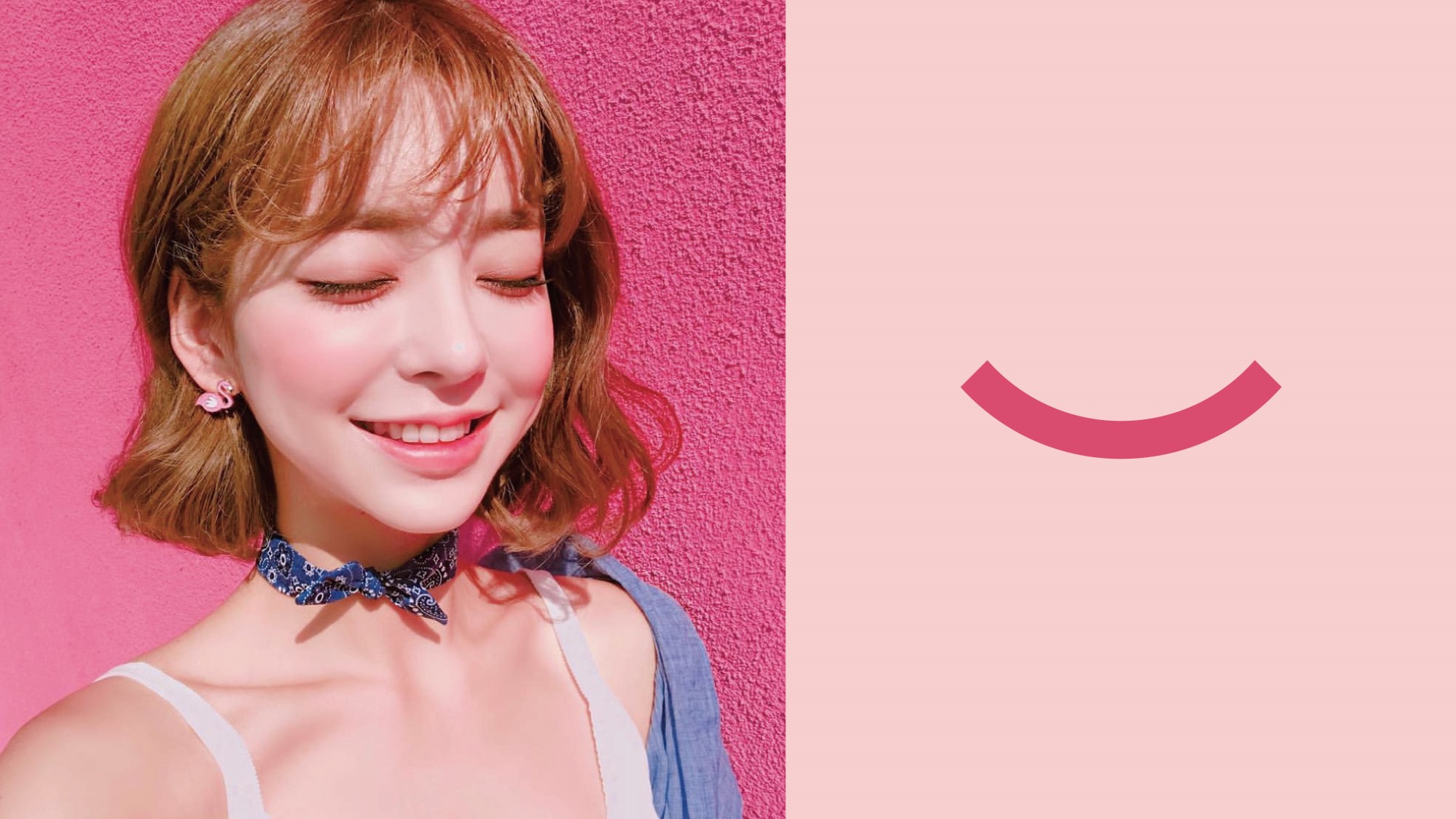
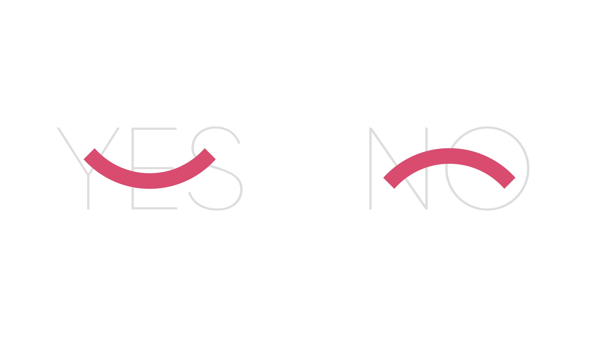
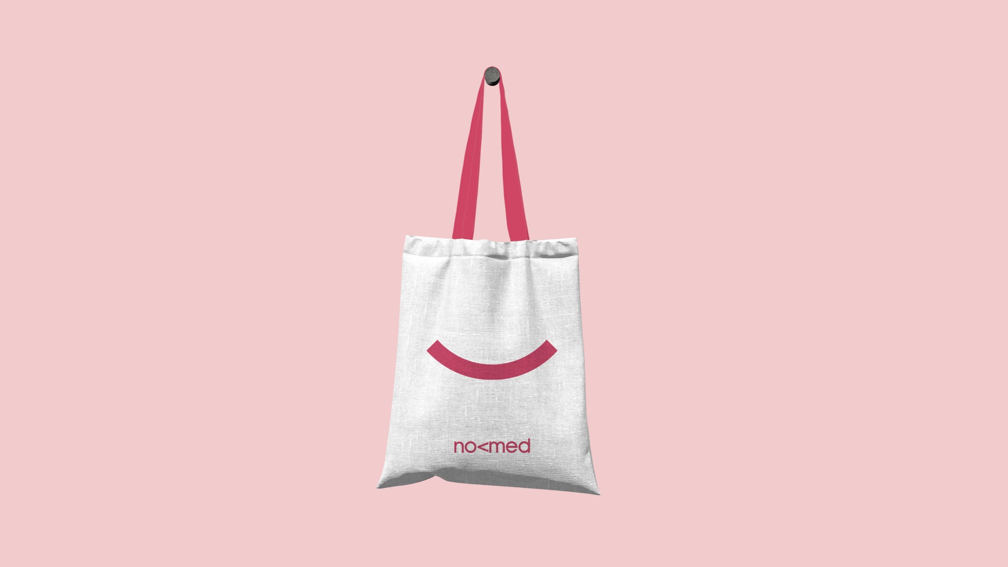
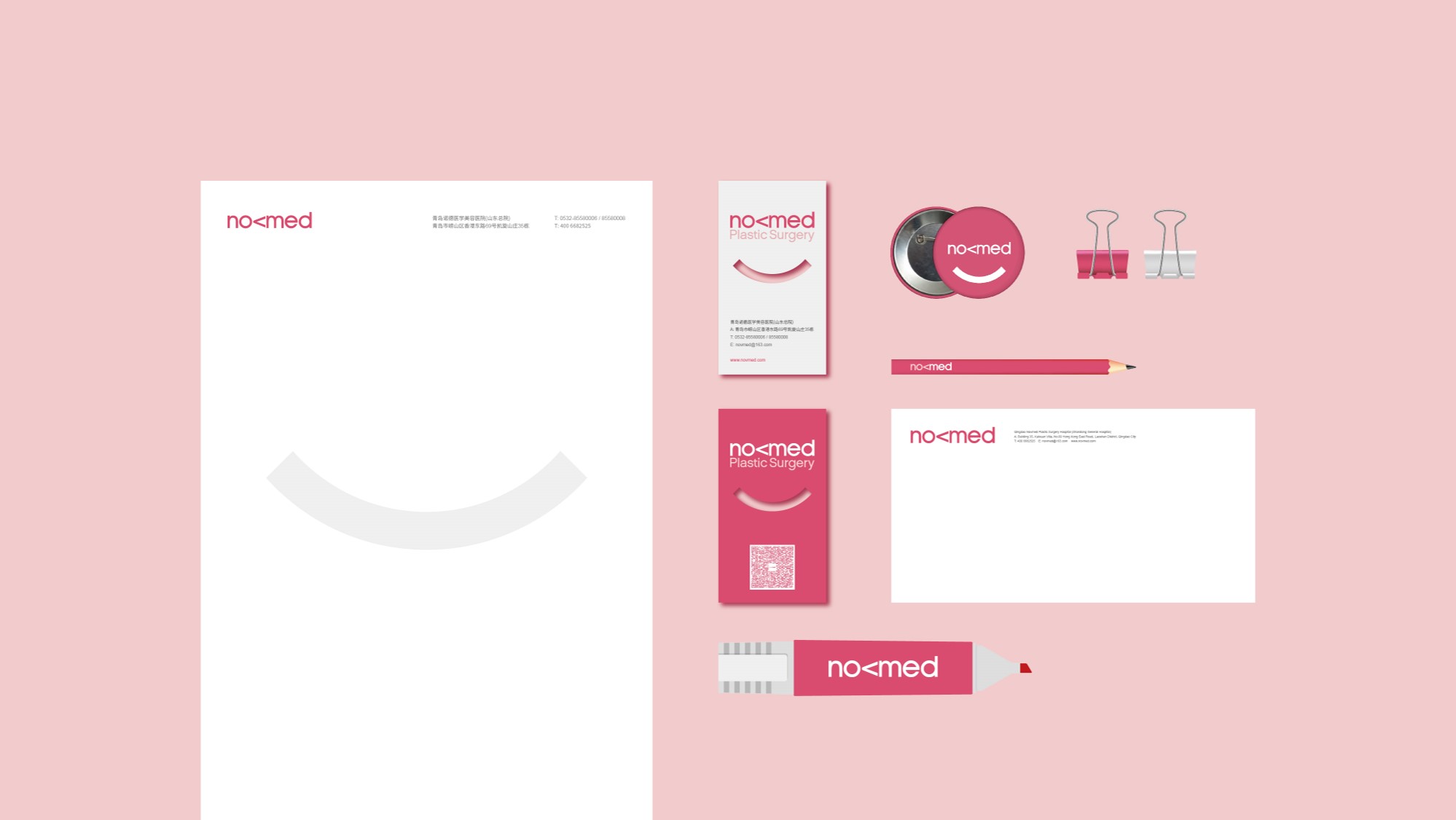
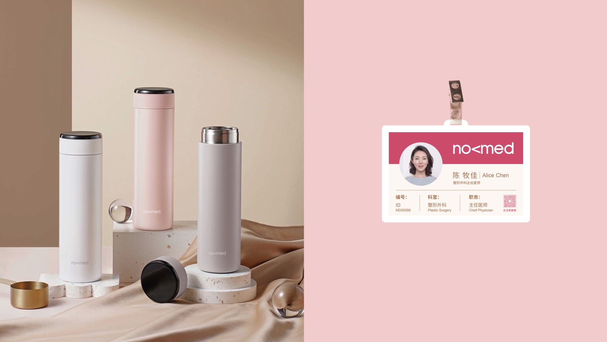
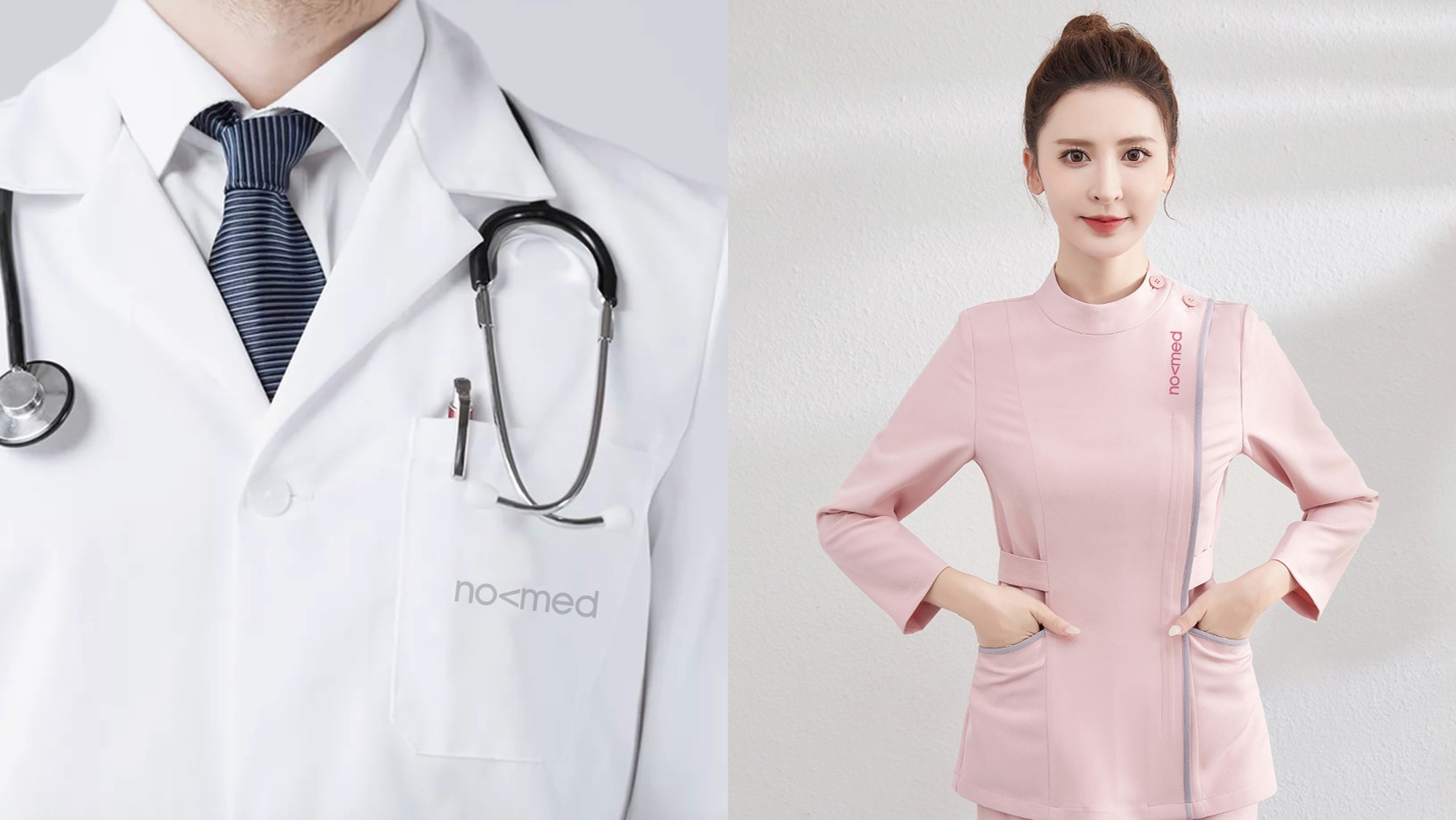
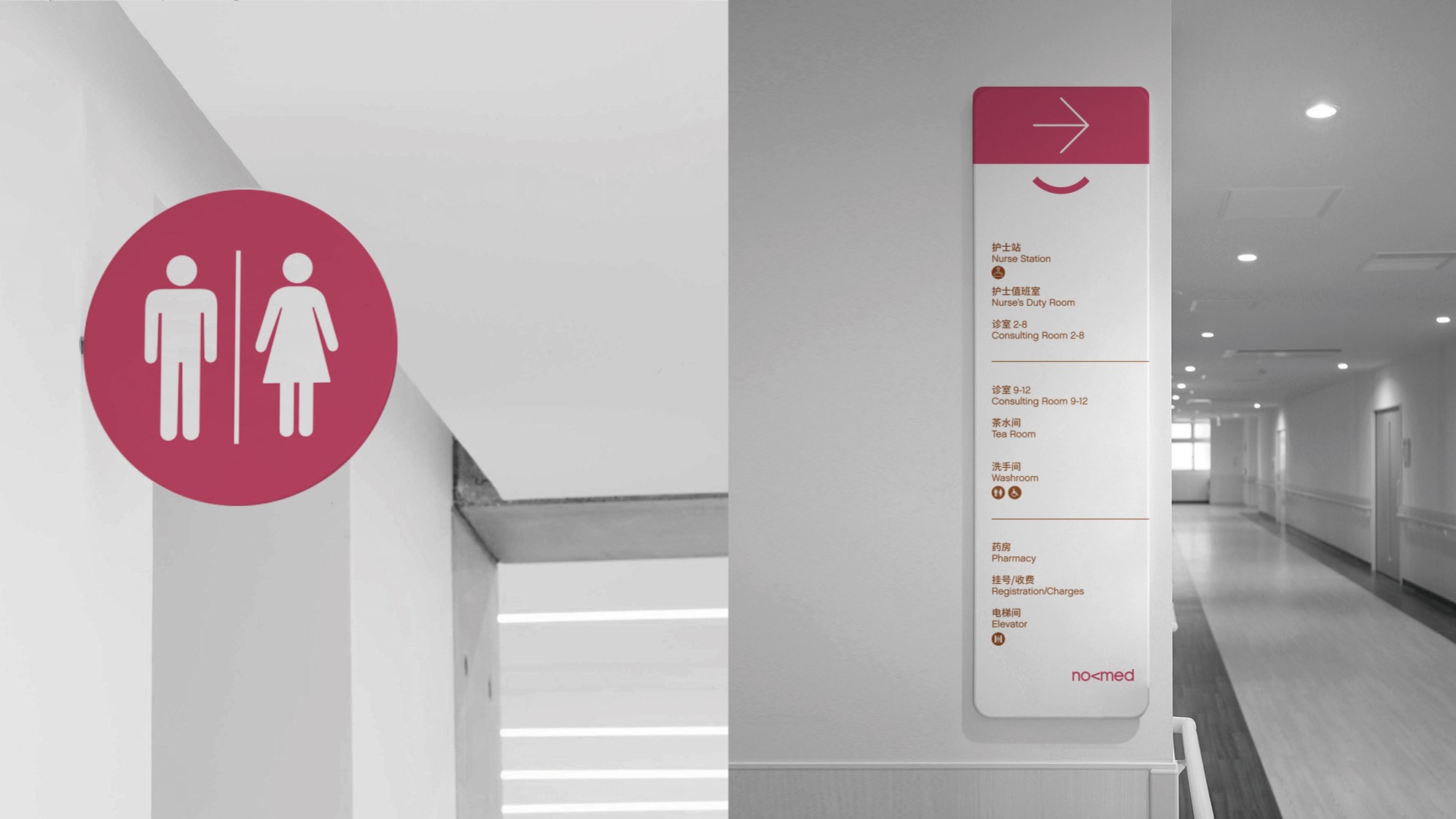
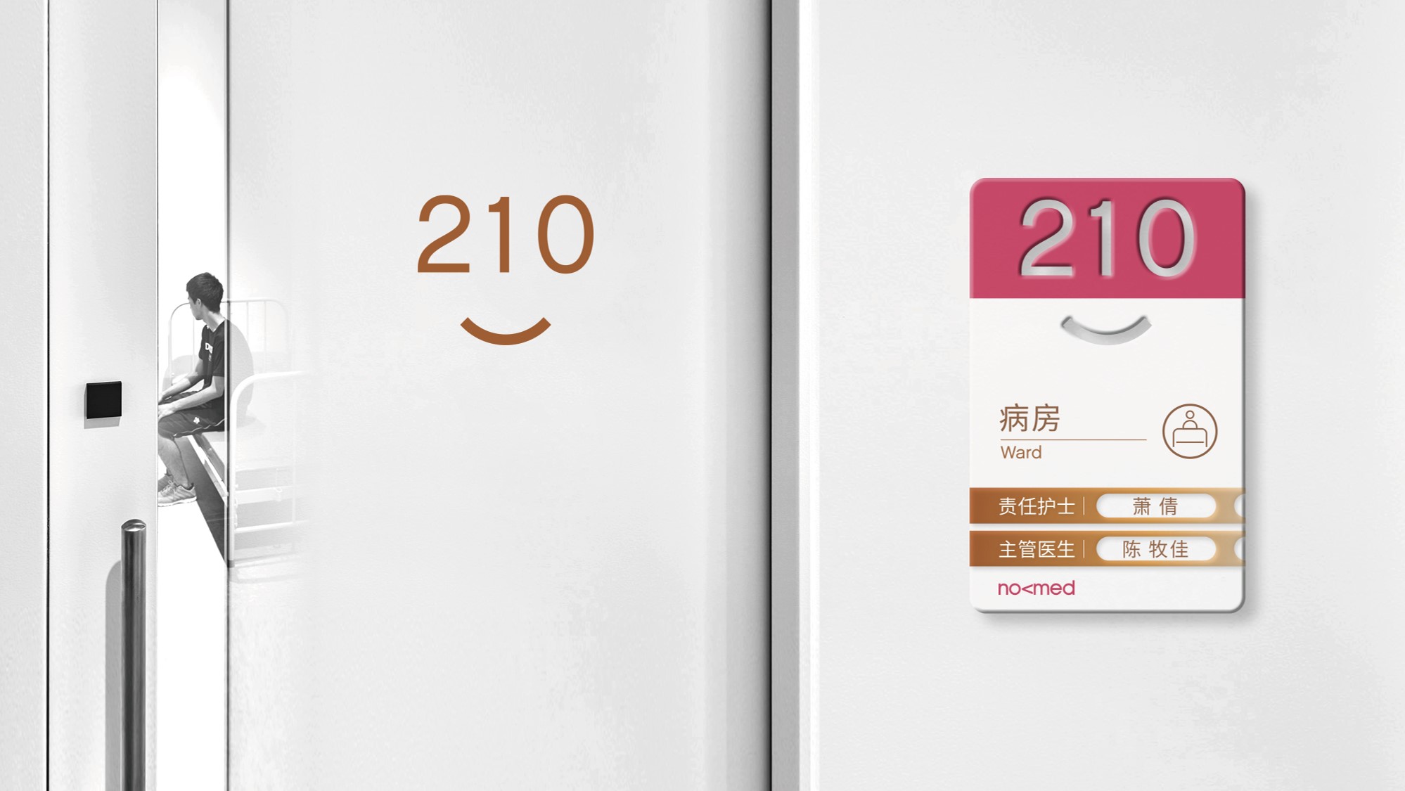
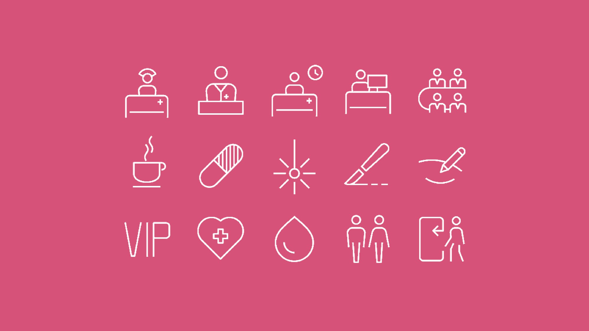
Shandong, China Ι Novomed Health Management (Medical Aesthetics)
As a medical beauty institution with high medical ethics and good reputation, Nuomeide has reconstructed its brand image in 2024.
The new image highlights the beauty of women, while also being youthful, fashionable, and international. The design boldly adopts the pink color scheme and selects the friendly smiley face symbol as an auxiliary element to establish the brand’s unique temperament and spirit in the medical beauty industry.